Tag: Product Design

  • Figma Fundamentals: Responsive Design

    Figma Fundamentals: Responsive Design

    This lesson dives into Figma’s tools and features for responsive design. You will explore constraints for element positioning, Auto Layout for dynamic components, and methods for creating adaptive layouts that work across different screen sizes and devices.

    Utilizing Auto Layout for Dynamic Components

    Figma’s Auto Layout feature allows designers to build flexible components that automatically adapt to content changes.

    Dynamic Components

    Auto Layout enables components to resize based on their content. Text blocks, buttons, and containers can expand or contract without breaking alignment.

    Responsive Components

    Auto Layout frames rearrange internal elements as the frame resizes. Spacing and alignment remain consistent, which helps maintain visual harmony across breakpoints.

    Web and mobile canvases

    Designing Adaptive Layouts

    Figma supports layouts that respond gracefully to multiple device sizes and orientations.

    Various Screen Sizes

    Designers can create frames for mobile, tablet, and desktop, then preview each variation to ensure consistency and usability.

    Device-Specific Designs

    Tailoring layouts to specific device types helps optimize the user experience. Mobile designs may prioritize vertical stacking, while desktop layouts can leverage additional horizontal space.

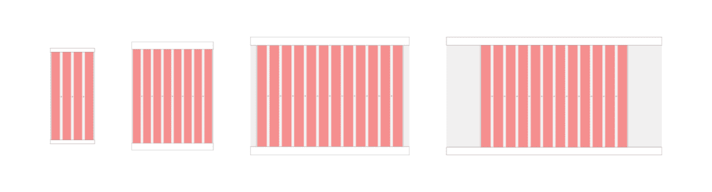
    Caption: In the example shown, a desktop frame uses a 12-column layout grid spanning 1280px inside a 1440px frame. The grid includes a 24px gutter and a 12px margin, which is a strong starting point for structured desktop design.

    Applying Constraints for Responsive Design

    Constraints define how elements behave when their parent frame changes size.

    Maintaining Element Positioning

    Constraints allow designers to anchor elements to edges or centers so their relative positions stay consistent during resizing.

    Scaling Elements

    Proportional scaling ensures icons, images, and containers resize smoothly without distortion, preserving visual balance across devices.

    Exercise: Auto Layout

    To reinforce these concepts, open Figma and follow along with a tutorial using any existing file or a new blank canvas. Apply Auto Layout to a few components, resize frames, and observe how spacing and alignment adjust automatically. Hands-on experimentation builds intuition quickly.

    Parting Words

    As we wrap up this lesson on responsive design, keep exploring and refining your approach. Share your progress, ask questions, and continue experimenting. Design improves through iteration and curiosity. Each small adjustment builds stronger systems and more resilient interfaces over time.

  • Figma Fundamentals: Mastering Components

    Figma Fundamentals: Mastering Components

    This article is part of a series on Figma Fundamentals.

    This lesson covers the creation and management of components in Figma, highlighting their role in maintaining consistency and efficiency in design workflows. It also emphasizes the use of variants within components for design flexibility and consistency across various design states.

    Creating Reusable Design Elements

    Figma’s components streamline design workflows by allowing the creation of reusable elements across projects.

    • Component Creation: Designers can create components from elements such as buttons, headers, or any design element by selecting the desired object and choosing “Create Component.” This action converts the element into a reusable component.
    • Reusability: Components enable consistent design application throughout a project. Editing a single instance of a component reflects changes across all instances, ensuring design coherence and efficiency.

    Managing Component Instances

    Efficient management of component instances is vital for maintaining design consistency and propagating changes.

    • Updating Components: Modifications made to a component propagate across all instances throughout the design, ensuring that design changes are unified and synchronized.
    • Propagating Changes: Changes made to a component instance are reflected in other instances across different pages or files where the component is used, allowing for easy design maintenance.

    Using Variants within Components

    Figma’s variants feature empowers designers to create design variations within components for increased flexibility.

    • Variant Creation: Variants within components allow for multiple design states or variations (e.g., different button states or header styles) without creating separate components. Designers can create and manage variants within a single component.
    • Design Consistency: Variants maintain design consistency by ensuring that various states or variations of a component adhere to predefined styles and attributes, promoting a unified design language.

    Exercise: Creating Components

    In our pursuit of hands-on learning, I’ve curated an engaging exercise for us to explore the principles discussed in this lessons. I encourage each of you to watch the provided video tutorial and concurrently follow along in Figma.  This exercise aims to solidify your understanding of the concepts we’ve covered, offering a practical application that enhances your skills and proficiency in real-time.

    Parting Words

    As we conclude this week’s lesson on Figma Fundamentals, thank you for being part of the learning journey! Join me again next week for more as we continue to explore Figma.

    Want to continue the conversation? Drop your thoughts in the comments below. If you found today’s article helpful, please consider sharing it with your network. Until next time, keep practicing, experimenting, and refining your skills. Remember, design is a journey of continuous improvement!

  • Figma Fundamentals: Importing and Organizing Assets

    Figma Fundamentals: Importing and Organizing Assets

    This article is part of a series on Figma Fundamentals.

    This lesson introduces the process of importing external assets, organizing elements within Figma files, and utilizing frames to maintain a structured and efficient design workflow in the Figma platform.

    Importing External Assets

    Figma facilitates the incorporation of various external assets, enriching designs with images, icons, and illustrations.

    • Adding Images: Users can import images into Figma by dragging and dropping them directly onto the canvas or by using the “Import” option in the toolbar. Supported image formats can be seamlessly integrated into designs.
    • Inserting Icons and Illustrations: Figma offers integrations with icon libraries and resources, allowing users to access and import icon sets or illustrations directly into their designs. These assets can be scaled and customized to suit design requirements.

    Organizing Assets within Figma Files

    Figma provides functionalities to maintain a structured and organized design workspace, essential for efficient collaboration and workflow management.

    • Grouping Elements: Users can group multiple elements together to keep related objects organized. Grouping helps in managing complex designs by allowing users to treat multiple objects as a single unit.
    • Renaming and Layer Organization: Renaming layers and components with descriptive names ensures clarity and ease of navigation within the layers panel. Users can arrange layers hierarchically, group related elements, and adjust layer visibility for better organization.

    Using Frames

    Figma employs frames as key organizational tools to manage and structure design components effectively.

    • Frames: Frames act as containers for content, providing structure and organization within designs. Elements placed within frames are contained and easily manipulated together.

    Exercise: Navigating Frames and Pages in Figma

    In our pursuit of hands-on learning, I’ve curated an engaging exercise for us to explore the principles discussed in this lessons. I encourage each of you to watch the provided video tutorial and concurrently follow along in Figma.  This exercise aims to solidify your understanding of the concepts we’ve covered, offering a practical application that enhances your skills and proficiency in real-time.

    Parting Words

    As we conclude this week’s lesson on Figma Fundamentals, thank you for being part of the learning journey! Join me again next week for more as we continue to explore Figma. Want to continue the conversation? Drop your thoughts in the comments below. If you found today’s article helpful, please consider sharing it with your network. Until next time, keep practicing, experimenting, and refining your skills. Remember, design is a journey of continuous improvement!

  • Figma Fundamentals: Working with Text

    Figma Fundamentals: Working with Text

    This article is part of a series on Figma Fundamentals.

    This lesson provides an overview of working with text in Figma, covering the process of adding text layers, applying text styles, and converting text into editable shapes for more advanced design purposes within the platform.

    Adding Text Layers

    Figma simplifies the process of incorporating textual content into designs by providing powerful text tools.

    • Creating Text Boxes: To add text to a design, users can select the text tool and click on the canvas. This action creates a text box where text can be inputted.
    • Inputting and Formatting Text: Once a text box is created, users can input and format text directly. Figma offers familiar text editing functionalities, allowing the adjustment of font styles, size, color, alignment, and more.

    Applying Text Styles

    Figma offers comprehensive text styling options to enhance the visual appearance of textual content.

    • Adjusting Font Size: Users can modify the size of text by selecting the text layer and adjusting the font size through the properties panel. Precise adjustments can be made to achieve the desired text size.
    • Color and Alignment: Text color and alignment can be easily modified to suit the design requirements. Users can select text elements and adjust color palettes or use alignment tools for precision.
    • Line Spacing and Style: Line spacing can be adjusted to control the vertical space between lines of text. Additionally, text styles like bold, italic, and underline are available for emphasizing text elements.

    Using Text as Shapes

    Figma allows users to convert text into editable shapes for design customization purposes.

    • Converting Text to Outlines: Text layers can be converted into vector shapes known as outlines. This action changes the text into editable vector paths, allowing users to manipulate text as shapes, apply effects, or create custom lettering designs.

    Exercise: Text Tool and Fonts

    In our pursuit of hands-on learning, I’ve curated an engaging exercise for us to explore the principles discussed in this lessons. I encourage each of you to watch the provided video tutorial and concurrently follow along in Figma. This exercise aims to solidify your understanding of the concepts we’ve covered, offering a practical application that enhances your skills and proficiency in real-time.

    Parting Words

    As we conclude this week’s lesson on Figma Fundamentals, thank you for being part of the learning journey! Join me again next week for more as we continue to explore Figma. Want to continue the conversation? Drop your thoughts in the comments below. If you found today’s article helpful, please consider sharing it with your network. Until next time, keep practicing, experimenting, and refining your skills. Remember, design is a journey of continuous improvement!

  • Figma Fundamentals: Creating and Editing Shapes

    Figma Fundamentals: Creating and Editing Shapes

    This article is part of a series on Figma Fundamentals.

    This lesson provides a comprehensive overview of using Figma’s shape tools, editing functionalities, and Boolean operations, empowering designers to create and manipulate shapes effectively within the platform.

    Utilizing Shape Tools

    Figma offers a variety of shape tools that enable designers to create fundamental geometric shapes swiftly.

    • Rectangles: The rectangle tool allows the creation of rectangular shapes. By clicking and dragging on the canvas, users can generate rectangles of various sizes and proportions.
    • Circles: With the circle tool, users can create perfect circles by clicking and dragging. Holding the Shift key while dragging ensures the creation of a perfect circle instead of an ellipse.
    • Polygons: Figma’s polygon tool facilitates the creation of multi-sided shapes. Users can adjust the number of sides by dragging while holding the mouse button, allowing the creation of triangles, hexagons, or any polygonal shape.

    Editing Shapes

    Figma provides powerful editing features for refining and customizing shapes to suit specific design needs.

    • Resizing: Shapes in Figma can be resized easily by clicking and dragging any of their resizing handles. Maintaining proportions while resizing is achievable by holding the Shift key.
    • Rotating: Shapes can be rotated by hovering outside the selection box until the cursor changes to a rotation icon. Clicking and dragging allows users to rotate the shape to desired angles.
    • Modifying Corners: Rounded corners in rectangles and other shapes can be adjusted by clicking and dragging the corner radius handles. This feature enables the creation of unique shapes with varying corner styles.

    Combining Shapes and Boolean Operations

    Figma allows users to combine shapes and perform Boolean operations to create complex shapes through interactions between them.

    • Combining Shapes: Shapes can be combined by overlapping them and using operations like union, subtract, intersect, and exclude to merge or modify their forms.
    • Boolean Operations: Union combines shapes to create a single combined shape. Subtract removes the overlap of shapes, intersect keeps only the overlapping areas, and exclude keeps only the non-overlapping portions, offering versatile ways to craft intricate shapes.

    Exercise: Shape Tools

    In our pursuit of hands-on learning, I’ve curated an engaging exercise for us to explore the principles discussed in this lessons. I encourage each of you to watch the provided video tutorial and concurrently follow along in Figma. This exercise aims to solidify your understanding of the concepts we’ve covered, offering a practical application that enhances your skills and proficiency in real-time.

    Parting Words

    As we conclude this week’s lesson on Figma Fundamentals, thank you for being part of the learning journey! Join me again next week for more as we continue to explore Figma. Want to continue the conversation? Drop your thoughts in the comments below. If you found today’s article helpful, please consider sharing it with your network. Until next time, keep practicing, experimenting, and refining your skills. Remember, design is a journey of continuous improvement!

  • Figma Fundamentals: Introduction to the Figma Interface

    Figma Fundamentals: Introduction to the Figma Interface

    This article is part of a series on Figma Fundamentals.

    In the world of product design, proficiency begins with mastering the essentials. Figma offers a gateway to a seamless design suite specifically tailored for product design. Before we dive into the intricacies of the Figma interface, let’s kickstart your journey by creating a Figma account and downloading the application.

    Creating Your Figma Account and Downloading the App

    Head to the Figma website, where a straightforward sign-up process awaits. Basic access to Figma is currently free however, I do suggest purchasing a subscription to allow for room to grow. Once your account is set up, the next step is to download the Figma application for your computer. Whether you’re on Windows or Mac, Figma’s compatibility ensures a smooth installation process. With your account created and the application at your fingertips, you’re now ready to immerse yourself in the world of Figma design.

    Figma’s Workspace Elements

    • Canvas: The canvas is the primary working area where designs are created. It acts as a blank space where users place and arrange design elements.
    • Toolbar: The toolbar houses a variety of tools for creating and manipulating design elements. It includes tools for selections, shapes, text, and more. These tools facilitate the design process by providing easy access to essential functionalities.
    • Layers Panel: The layers panel displays a hierarchical view of all design elements within a file. Users can organize and manage layers by rearranging them, grouping elements, and adjusting their visibility or properties.
    Figma interface example

    Caption: In this screenshot, we can see the Figma Canvas (middle), Toolbar (top), and Layers Panel (left).

    Understanding the Design Panel

    • Adjusting Styles: The Design Panel allows users to modify various styles of selected elements, such as adjusting fill and stroke colors, border styles, shadows, and more. It provides precise control over the visual appearance of design elements.
    • Alignment and Distribution: Within the properties panel, alignment options enable precise arrangement and distribution of elements. Users can align objects vertically, horizontally, distribute spacing evenly, and adjust their positions relative to one another.
    • Applying Effects: Figma’s properties panel also offers effects like blurs, shadows, and other visual enhancements that can be applied to elements to create depth and visual interest in designs.
    Figma interface example

    Caption: In the same screenshot, we can see the Figma Design Panel (right), which allows access to design controls and options for creating and editing elements within the canvas.

    Navigating and Using Essential Tools

    • Selection Tool: The selection tool allows users to click and manipulate design elements. It is essential for moving, resizing, and editing objects within the canvas.
    • Shapes Tool: Figma provides various shape tools, including rectangles, circles, polygons, and more. These tools help in creating basic shapes that form the foundation of design elements.
    • Text Tool: The text tool enables the addition of text layers to designs. Users can input text, format it, and adjust typography settings to customize the textual content.

    Key Takeaways

    1. Starting with Figma: Creating a Figma account and downloading the application marks the beginning of your journey into Figma design. It’s accessible, with a straightforward sign-up process and compatibility across Windows and Mac systems.
    2. Understanding Figma’s Workspace Elements: The canvas acts as the primary workspace for creating designs, while the toolbar provides essential design tools and functionalities. The layers panel offers a hierarchical view and management system for design elements within a file.
    3. Utilizing the Design Panel: Figma’s Design Panel allows for precise modifications to element styles, including fill colors, strokes, shadows, and more. It also facilitates alignment, distribution, and the application of visual effects to enhance designs.
    4. Essential Tools for Design: The selection tool aids in manipulating elements, while shape tools assist in creating basic shapes. The text tool enables text layer additions with formatting and typography adjustments for customizable textual content.

    These takeaways highlight the foundational aspects covered in the lesson, emphasizing the starting point with Figma, understanding its workspace elements and design tools, and beginning to navigate the interface for creating designs.

    Parting Words

    As we conclude this week’s lesson on Figma Fundamentals, thank you for being part of the learning journey! Join me again next week for more as we continue to explore Figma.

    Want to continue the conversation? Drop your thoughts in the comments below. If you found today’s article helpful, please consider sharing it with your network.

    Until next time, keep practicing, experimenting, and refining your skills. Remember, design is a journey of continuous improvement!

  • Figma Fundamentals: A Beginners Guide

    Figma Fundamentals: A Beginners Guide

    This article is part of a series on Figma Fundamentals.

    Lesson Outline

    Over the next twelve weeks, I’ll to introduce you to the wonderful world of Figma. Throughout these weekly lessons, we’ll embark on an exciting journey, starting with the basics of Figma’s interface and gradually explore essential design principles and functionalities. From creating shapes and mastering components to collaboration and prototyping, this series will equip you with the foundational skills needed to confidently navigate Figma’s workspace, create captivating designs, and collaborate effectively with teams.

    Lesson 1: Introduction to Figma Interface

    • Overview of Figma’s workspace elements: canvas, toolbar, layers panel
    • Understanding the properties panel: adjusting styles, alignment, and effects
    • Navigating and using essential tools: selection, shapes, and text tools

    Lesson 2: Creating and Editing Shapes

    • Utilizing shape tools to create basic geometric shapes: rectangles, circles, polygons
    • Editing shapes using Figma’s editing features: resizing, rotating, and modifying corners
    • Combining shapes and using boolean operations for complex shapes

    Lesson 3: Working with Text

    • Adding text layers: creating text boxes, inputting and formatting text
    • Applying text styles: adjusting font size, color, alignment, and line spacing
    • Using text as shapes: converting text to outlines for design purposes

    Lesson 4: Importing and Organizing Assets

    • Importing external assets: adding images, icons, and illustrations to Figma
    • Organizing assets within Figma files: grouping, renaming, and arranging layers
    • Using frames to manage and organize design components

    Lesson 5: Mastering Components

    • Creating components for reusable design elements: buttons, headers, etc.
    • Managing component instances: updating and propagating changes across designs
    • Using variants within components for design variations

    Lesson 6: Responsive Design

    • Applying constraints for responsive design: maintaining element positioning and scaling
    • Utilizing auto-layout for dynamic and responsive components
    • Designing adaptive layouts for various screen sizes and devices

    Lesson 7: Plugins and Integrations

    • Exploring Figma’s plugin ecosystem: installing and using plugins for added functionalities
    • Integrating with third-party tools: using integrations for seamless workflows
    • Customizing Figma with plugins: enhancing design, productivity, and collaboration

    Lesson 8: Prototyping Basics

    • Creating interactive prototypes: linking frames and screens for user flow
    • Adding basic interactions: hover effects, click-through actions, and transitions
    • Previewing and testing prototypes within Figma’s interactive environment

    Lesson 9: Collaboration and Sharing

    • Collaborating in real-time: using comments, mentions, and shared editing features
    • Sharing Figma files: setting permissions and access levels for team members
    • Using collaboration features: tracking changes, resolving conflicts, and maintaining version control

    Lesson 10: Version History

    • Accessing version history: reviewing and restoring previous versions of Figma files
    • Managing changes over time: comparing versions and tracking modifications
    • Reverting to older versions: restoring specific iterations or stages of design files

    Activity: Responsive Components

    This activity covers key aspects from each section of the lessons, providing a broad overview of essential concepts in product design and bringing them together in a real-world example.

    Parting Words

    As we conclude this week’s introduction to Figma Fundamentals, thank you for being part of the learning journey! Join me again next week for more as we continue to explore Figma.

    Want to continue the conversation? Drop your thoughts in the comments below. If you found today’s article helpful, please consider sharing it with your network.

    Until next time, keep practicing, experimenting, and refining your skills. Remember, design is a journey of continuous improvement!

  • Crafting Consistency for Scale: Design System Exercise

    Crafting Consistency for Scale: Design System Exercise


    This article is part of a series on Design System Management.

    The objective of this activity is to build a comprehensive design system in Figma that encompasses typography, color palette, UI components, and design guidelines.

    Requirements

    • Access to Figma (either through a personal account or a shared team account)
    • Basic understanding of design principles, including typography, color theory, and UI design
    • Familiarity with Figma’s interface and tools (you may benefit from completing Figma tutorials or training beforehand)

    Instructions

    1. Define the Scope:
      • Identify the scope of your design system, including the platforms (e.g., web, mobile) and the target audience (e.g., users, developers, stakeholders).
    2. Establish Design Principles:
      • Define the design principles that will guide your design system, such as consistency, accessibility, and scalability.
    3. Create a Typography System:
      • Define a typography system that includes font styles (e.g., headings, body text), font sizes, line heights, and font weights.
      • Use Figma’s text styles feature to create reusable text styles for consistent typography throughout your designs.
    4. Develop a Color Palette:
      • Choose a color palette that aligns with your brand identity and design principles.
      • Define primary and secondary colors, as well as accent colors for interactive elements.
      • Use Figma’s color styles feature to create reusable color styles for consistent color application across your designs.
    5. Design UI Components:
      • Design a set of UI components, such as buttons, form elements, cards, navigation bars, and icons.
      • Ensure that these components follow your established design principles and are reusable across different screens and projects.
      • Use Figma’s component feature to create reusable component instances and variants.
    6. Document Design Guidelines:
      • Create documentation that outlines the usage guidelines for each aspect of your design system, including typography, color, and UI components.
      • Include examples, usage instructions, and best practices to guide designers, developers, and other stakeholders.
    7. Prototype and Test:
      • Prototype sample screens or workflows using the components and styles from your design system.
      • Test the usability, accessibility, and visual consistency of your designs to ensure they meet the needs of your target audience.
    8. Share and Gather Feedback:
      • Share your design system with peers, mentors, or stakeholders for feedback.
      • Incorporate any feedback or suggestions to iterate and improve your design system.
    9. Finalize and Publish:
      • Finalize your design system based on the feedback received and any additional refinements.
      • Publish your design system documentation and assets in a centralized location for easy access and reference by your team.

    Evaluation Criteria

    Upon completion, please schedule a review. Participants will be evaluated based on the following criteria:

    • Completeness: Does the design system include all essential components, styles, and guidelines?
    • Consistency: Are the typography, color palette, and UI components consistent and aligned with the established design principles?
    • Reusability: Are the UI components designed to be reusable across different screens and projects?
    • Clarity: Is the documentation clear and comprehensive, providing guidance on usage and best practices?
    • Usability: Are the designs functional, accessible, and user-friendly?

    By completing this activity, individuals can demonstrate their proficiency in building a design system in Figma, showcasing their ability to create cohesive and scalable design solutions that meet the needs of their organization or project.


    Thank you for taking the time to read my article! I value your interest and engagement. I invite you to continue the conversation by sharing your thoughts, questions, or feedback in the comments section below.

    Don’t forget to like and share this article with your network if you found it valuable. And remember to check back in a couple weeks for my next insightful article. Until then, stay creative and keep exploring!

  • Crafting Consistency for Scale: Implementing and Maintaining a Design System

    Crafting Consistency for Scale: Implementing and Maintaining a Design System


    This article is part of a series on Design System Management.

    Welcome to Lesson 5 of our guide to design system management. In this lesson, we’ll explore the iterative development process of setting up and updating a design system, collaboration strategies among designers, developers, and stakeholders, tactics for ensuring adoption and adherence to the design system, and methods for monitoring and updating the system as products evolve.

    Iterative Development Process

    Implementing a design system is not a one-time project; it’s an ongoing process that evolves with your products and organization. The iterative development process involves several key stages:

    • Initial Setup: Begin by defining the foundational elements of your design system, such as typography, color palette, and UI components. Create a living style guide or design documentation to communicate these standards to the team.
    • Component Creation: Develop reusable UI components based on the established design principles. Iterate on these components based on feedback from designers, developers, and users.
    • Integration: Integrate the design system into your design and development workflows, ensuring that designers and developers have access to the latest components and guidelines.
    • Ongoing Updates: Continuously refine and expand the design system as new patterns emerge, technologies evolve, and user needs change. Regularly solicit feedback from stakeholders to identify areas for improvement.

    Airbnb’s design system, called “DLS” (Design Language System), underwent multiple iterations to align with the company’s evolving product ecosystem. By following an iterative development process, Airbnb was able to adapt its design system to meet the needs of different platforms and user segments.

    Collaboration Between Designers, Developers, and Stakeholders

    Successful design systems require strong collaboration between designers, developers, and stakeholders. Here are some strategies to foster effective collaboration:

    • Cross-functional Teams: Encourage designers, developers, and stakeholders to work together in cross-functional teams to ensure alignment and transparency throughout the design system’s lifecycle.
    • Regular Sync Meetings: Schedule regular sync meetings where team members can discuss progress, share insights, and address challenges. Use tools like Slack, Zoom, or project management software to facilitate communication.
    • Co-design Sessions: Host co-design sessions where designers and developers collaborate on creating and refining UI components. This collaborative approach ensures that both design and technical considerations are taken into account.

    At Atlassian, the team uses a collaborative approach called “Design Spikes” to explore and validate design solutions. These spikes involve designers, developers, and product managers working together to rapidly prototype and iterate on ideas, fostering cross-functional collaboration and innovation.

    Strategies for Ensuring Adoption and Adherence to the Design System

    Adoption and adherence to the design system are critical for its success. Here are some strategies to promote adoption:

    • Education and Training: Provide training sessions and resources to familiarize team members with the design system’s principles, guidelines, and tools.
    • Incentives: Offer incentives, such as recognition or rewards, for teams that successfully implement and adhere to the design system in their projects.
    • Continuous Support: Provide ongoing support and guidance to teams as they integrate the design system into their workflows. Address any challenges or concerns they may encounter along the way.

    Google’s Material Design system offers extensive documentation, tutorials, and resources to help designers and developers adopt its guidelines. Google also provides tools like Material Design Components for different platforms to facilitate implementation and adherence.

    Monitoring and Updating the Design System as Products Evolve

    As products evolve, it’s essential to monitor and update the design system to ensure relevance and consistency. Here are some methods for monitoring and updating the design system:

    • Usage Analytics: Track usage metrics and user feedback to identify areas of the design system that may need improvement or refinement.
    • Versioning: Implement versioning to manage changes and updates to the design system effectively. Clearly communicate changes to stakeholders and provide migration paths for existing projects.
    • Feedback Loops: Establish feedback loops with designers, developers, and stakeholders to gather insights and suggestions for improving the design system over time.

    Salesforce’s Lightning Design System incorporates a feedback mechanism where users can submit feedback and requests directly through the documentation website. Salesforce uses this feedback to prioritize updates and enhancements to the design system.

    Final Thoughts

    Implementing and maintaining a design system is a complex but rewarding endeavor. By following an iterative development process, fostering collaboration among team members, promoting adoption and adherence, and monitoring and updating the system as products evolve, organizations can create consistent, efficient, and user-centric experiences across their products and platforms.


    Thank you for taking the time to read my article! I value your interest and engagement. I invite you to continue the conversation by sharing your thoughts, questions, or feedback in the comments section below.

    Don’t forget to like and share this article with your network if you found it valuable. And remember to check back in a couple weeks for my next insightful article. Until then, stay creative and keep exploring!

  • Crafting Consistency for Scale: Tools and Technologies for Design Systems

    Crafting Consistency for Scale: Tools and Technologies for Design Systems


    This article is part of a series on Design System Management.

    Welcome to Lesson 4, where we explore the tools and technologies essential for developing and maintaining design systems. In this lesson, we’ll introduce Figma as a powerful platform for creating design systems, discuss collaborative workflows for design system development, and explore version control and documentation practices to ensure the integrity and consistency of design systems.

    Introduction to Design Systems in Figma

    Figma has emerged as a popular tool for designing and prototyping user interfaces, and its collaborative features make it well-suited for developing design systems. Figma’s components, styles, libraries, and shared libraries can be leveraged to establish and maintain a cohesive design system. Additionally, Figma’s real-time collaboration features facilitate seamless communication and collaboration among designers and developers working on a design system.

    In this lesson, we’ve explored using Figma as tool/technology for Design System management. By understanding the importance of effective collaboration and documentation, and implementing them effectively, designers can create cohesive and impactful designs quickly, that resonate with users and reinforce brand identity. 

    Caption:The Material 3 Figma Design Kit provides a comprehensive design system, with styles and components to help you get started. 

    Collaborative Workflows for Design System Development

    Effective collaboration is key to the successful development of a design system. Cross-functional teams can collaborate efficiently using Figma to iterate on design system components, gather feedback, and incorporate changes. Figma enables communication, alignment, and accountability among team members throughout the design system development process.

    Caption: This screenshot shows a user generated comment in Figma. Give feedback, ask a question, or just leave a note -enable comment mode and click anywhere in a Figma file to leave a comment.

    Version Control and Documentation

    Version control and documentation are essential for maintaining the integrity and consistency of a design system over time. Figma’s version history and branching features can be used to track changes, manage revisions, and ensure version control in collaborative environments. Additionally, Figma’s tools enable documenting and maintaining comprehensive design documentation including; design system guidelines, standards, and best practices.

    Caption:This screenshot displays the Version History panel in Figma (right).

    Final Thoughts

    In this lesson, we’ve explored using Figma as tool/technology for Design System management. By understanding the importance of effective collaboration and documentation, and implementing them effectively, designers can create cohesive and impactful designs quickly, that resonate with users and reinforce brand identity.


    Thank you for taking the time to read my article! I value your interest and engagement. I invite you to continue the conversation by sharing your thoughts, questions, or feedback in the comments section below.

    Don’t forget to like and share this article with your network if you found it valuable. And remember to check back in a couple weeks for my next insightful article. Until then, stay creative and keep exploring!