Tag: design

  • Figma Fundamentals: Responsive Component Activity

    Figma Fundamentals: Responsive Component Activity

    Note: This article is part of a series on Figma Fundamentals.

    By following the step-by-step process outlined in this lesson, you will create a base component, utilize instances for efficiency, and maintain uniformity across your design. In addition, you may practice inclusive design by exploring accessibility considerations. As you continue to apply these fundamentals in your projects, you are not just creating visually appealing interfaces, you are also fostering a user-centric approach.

    Objective

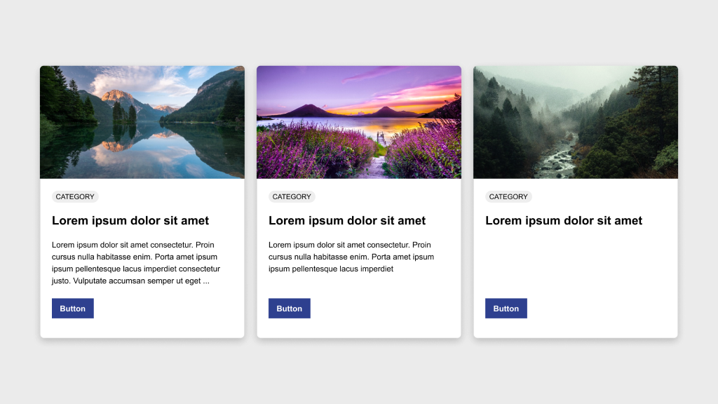
    Create a row of three cards in Figma, ensuring consistency in height and structure. One card will serve as the base component while the other two will be instances of this component.

    Elements

    Each card should include:

    • Image
    • Category badge
    • Title
    • Description
    • Button

    Process

    1. Design the base card by arranging the elements according to the provided example.
    2. Convert this base card into a component by selecting it and clicking Create Component in the toolbar or using the shortcut Ctrl/Cmd + Alt + K.
    3. Duplicate the component twice to create two instances beside the original.
    4. Customize the content of the instances as needed while keeping spacing and design elements consistent.
    5. Ensure all three cards maintain the same height for a uniform appearance.
    6. Experiment with responsive behavior by adjusting layout or content and observing how the cards adapt to different screen sizes.

    Bonus

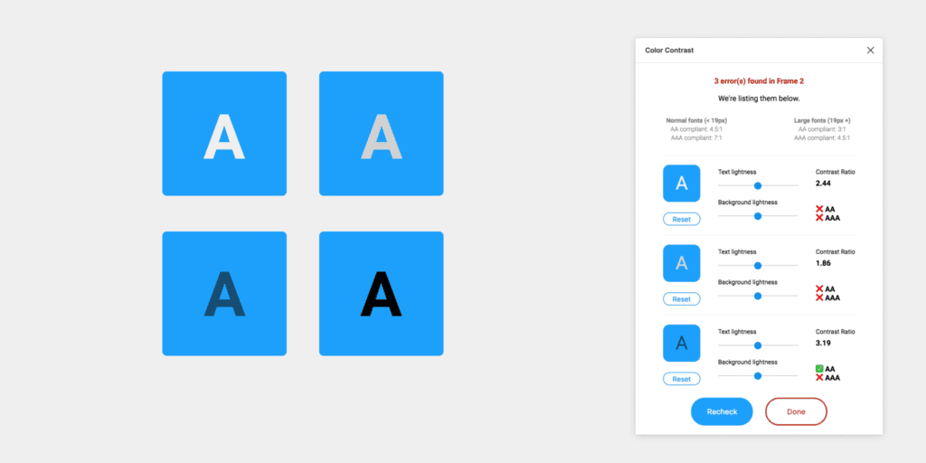
    Use this accessibility plugin to verify that your component passes accessibility standards.

    Discussion

    Once satisfied with the design, schedule a 30 minute call with me to review.

    Parting Words

    As we conclude this lesson in the Figma Fundamentals series, thank you for being part of the learning journey. Join me again next week as we explore a new topic.

    If you would like to continue the conversation, share your thoughts in the comments. If you found this helpful, consider sharing it with your network. Until next time, keep practicing, experimenting, and refining your skills. Design is a journey of continuous improvement.

  • Figma Fundamentals: Version History

    Figma Fundamentals: Version History

    Note: This article is part of a series on Figma Fundamentals.

    This lesson outlines Figma’s version history functionality, including accessing, managing, comparing versions, and reverting to earlier iterations. The goal is to empower designers to track design progress and maintain control over the evolution of their projects.

    Accessing Version History

    Figma maintains a comprehensive version history that allows users to review and restore previous iterations of design files.

    Reviewing Versions

    Users can access version history through File → Show Version History, where they can browse snapshots of a file’s evolution over time. Each version represents a specific stage of the design.

    Restoring Previous Versions

    Designers can restore earlier versions of a file, giving them flexibility to revert to specific iterations whenever needed.

    Caption:This screenshot displays the Version History panel on the right.

    Managing Changes Over Time

    Figma’s version history allows users to compare versions, track modifications, and better understand how a design has evolved.

    Comparing Versions

    Designers can view two versions side by side to visualize what changed between iterations. This makes it easier to understand progress and decision paths.

    Tracking Modifications

    Figma records and displays what elements were added, removed, or altered in each version, helping teams maintain clarity and accountability.

    Reverting to Older Versions

    Version history empowers designers to safely explore ideas while maintaining the ability to return to stable points in time.

    Restoring Specific Iterations

    Users can quickly revert to older versions, ensuring flexibility when experimenting or recovering from mistakes.

    Maintaining Design Integrity

    Reverting preserves the integrity of a design and protects against unintended changes.

    Exercise: Archiving Pages in a File

    To reinforce these concepts, complete the following exercise while watching the accompanying tutorial. Follow along in Figma using any existing or new file. This hands-on activity helps solidify your understanding and builds real-time proficiency.

    Video Tutorial:

    Parting Words

    As we conclude this week’s lesson on Figma Fundamentals, thank you for being part of the learning journey. Join me again next week as we continue exploring new topics. If you would like to continue the conversation, share your thoughts in the comments. If you found this article helpful, consider sharing it with your network. Keep practicing, experimenting, and refining your skills. Design is a journey of continuous improvement.

  • Figma Fundamentals: Collaboration and Sharing

    Figma Fundamentals: Collaboration and Sharing

    Note: This article is part of a series on Figma Fundamentals.

    This lesson covers Figma’s collaboration features, including real-time editing, comments, sharing permissions, branching, change tracking, and version control. The goal is to help designers and teams work together efficiently while maintaining clarity and control over their files.

    Collaborating in Real Time

    Figma enables seamless real-time collaboration so multiple team members can work together in the same file simultaneously.

    Comments and Mentions

    Users can leave comments directly on specific design elements to facilitate discussion and feedback. Using the @ mention notifies teammates and keeps communication focused and contextual.

    Shared Editing

    Multiple users can edit a design file at the same time. This ensures everyone is working on the most up-to-date version and reduces delays caused by file handoffs.

    Captions: This screenshot shows a user-generated comment in Figma. Enable comment mode and click anywhere in a file to leave feedback, ask a question, or add a note.

    Sharing Figma Files

    Figma offers flexible sharing capabilities that allow designers to control access and permissions for collaborators.

    Permission Settings

    Designers can define who can view, comment, or edit files. This ensures only authorized individuals can make changes.

    Team Collaboration

    Sharing files with teammates or clients streamlines collaboration and keeps everyone aligned with the latest updates.

    Branching Files

    Designers can create branches within files so different teams or individuals can work on separate versions. Branching supports parallel development without affecting the main file until changes are ready to merge.

    Using Collaboration Features

    Figma provides tools that help teams manage collaborative workflows and maintain version control.

    Change Tracking

    Figma records who made changes and when, giving visibility into design evolution and accountability.

    Resolving Conflicts

    When conflicting edits occur, Figma provides merge and conflict resolution tools to keep collaboration cohesive.

    Version Control

    Version history allows designers to access and revert to earlier iterations whenever necessary.

    Exercise: Branching and Merging

    To reinforce these concepts, complete the following exercise while watching the accompanying tutorial. Follow along in Figma using any existing or new file. This hands-on activity helps solidify your understanding and builds real-time proficiency.

    Video Tutorial:

    Parting Words

    As we conclude this lesson on Figma Fundamentals, thank you for being part of the learning journey. Join me again next week as we continue exploring new topics. If you would like to continue the conversation, share your thoughts in the comments. If you found this article helpful, consider sharing it with your network. Keep practicing, experimenting, and refining your skills. Design is a journey of continuous improvement.

  • Figma Fundamentals: Prototyping Basics

    Figma Fundamentals: Prototyping Basics

    Note: This article is part of a series on Figma Fundamentals.

    This lesson covers the basics of prototyping within Figma, including creating interactive prototypes, adding essential interactions, and using Figma’s environment for previewing and testing designs to ensure a seamless user experience.

    Creating Interactive Prototypes

    Figma enables designers to create interactive prototypes by linking frames and screens to simulate user flows and interactions.

    Linking Frames

    Designers can create interactive prototypes by linking frames or artboards together. This establishes connections between screens and enables seamless navigation.

    Establishing User Flow

    By linking frames with interactions, designers define the user journey, allowing stakeholders to visualize and understand the flow of the design.

    Exercise: Prototyping

    In our pursuit of hands-on learning, I’ve curated an engaging exercise to explore the principles discussed in this lesson. Watch the video tutorial and follow along in Figma using two blank frames. This exercise will help solidify your understanding and build real-time proficiency.

    Video Tutorial:

    Adding Basic Interactions

    Figma empowers designers to add basic interactions to prototypes, enhancing user experience and functionality.

    Hover Effects

    Designers can simulate hover effects by linking frames with mouse-over interactions. This replicates how elements respond when hovered, creating a more realistic experience.

    Click-Through Actions

    Adding click interactions to elements allows users to simulate actions like button clicks or menu selections, navigating between linked frames.

    Transitions

    Figma provides transition effects such as slide, dissolve, and smart animate that designers can apply between frames. These transitions add dynamism and polish to a prototype.

    Previewing and Testing Prototypes

    Figma offers an interactive environment for designers to preview and test prototypes to ensure a seamless user experience.

    Interactive Preview

    Designers can preview prototypes within Figma’s environment, simulating user interactions to evaluate functionality and flow.

    Testing Functionality

    Testing prototypes helps identify usability issues or inconsistencies in the user flow, creating an opportunity for refinement before implementation.

    Advanced Exercise: Prototyping and Transitions

    To go a level deeper, watch the following tutorial and apply what you learn in your own file. This exercise reinforces transitions and adds polish to your interactions.

    Video Tutorial:

    Parting Words

    As we conclude this week’s lesson on Figma Fundamentals, thank you for being part of the learning journey. Join me again next week as we continue exploring Figma. Want to continue the conversation? Drop your thoughts in the comments below.

    If you found today’s article helpful, please consider sharing it with your network. Until next time, keep practicing, experimenting, and refining your skills. Remember, design is a journey of continuous improvement!

  • Figma Fundamentals: Plugins and Integrations

    Figma Fundamentals: Plugins and Integrations

    Note: This article is part of a series on Figma Fundamentals.

    This lesson covers the exploration of Figma’s plugin ecosystem, the integration of Figma with third-party tools for enhanced collaboration, and the use of plugins to customize and augment Figma’s functionality to suit specific design needs.

    Exploring Figma’s Plugin Ecosystem

    Figma offers a diverse ecosystem of plugins that extend its functionality and support a wide range of design needs.

    Installing Plugins

    Access Figma’s plugin library through the Community tab in the Figma app or via Figma’s website. You can browse, install, and manage plugins directly within Figma.

    Using Plugins

    Once installed, plugins appear in the side panel within Figma. From there, you can run plugin features and use them to support your design workflows.

    Integrating with Third-Party Tools

    Figma supports integrations with third-party tools that help teams collaborate and stay aligned.

    Seamless Workflows

    Integrations with tools like Slack, GitHub, and others streamline collaboration by enabling teams to embed designs, share feedback, and synchronize design updates directly within those platforms.

    Cross-Platform Functionality

    Integrations help bridge communication gaps between Figma and other platforms, enabling teams to work efficiently across different environments.

    Customizing Figma with Plugins

    Plugins empower users to tailor Figma to their specific needs and increase productivity.

    Enhanced Functionality

    Plugins can extend Figma’s capabilities for tasks like data visualization, prototyping, accessibility checks, and more.

    Improved Collaboration

    Some plugins focus on collaboration, supporting workflows like design handoff, team coordination, and operational consistency.

    Exercise: Utilizing Plugins

    In our pursuit of hands-on learning, I’ve curated an engaging exercise to explore the principles discussed in this lesson. Install the plugins below and experiment in Figma. This exercise will help solidify your understanding and build real-time proficiency.

    Recommended Plugins

    Color Contrast Checker

    This plugin checks the color contrast ratio of all visible text in a frame and provides feedback on whether it meets WCAG AA and/or AAA compliance. Click the “Try it out” button to experiment in a Figma file.

    View plugin details

    Lorem Ipsum

    Fill your designs with placeholders in a click: text, images, and even data. Generate Lorem Ipsum to fill text layers, fill shapes with images from Unsplash, and populate designs with fake data such as profiles or company info. Click the “Try it out” button to experiment in a Figma file.

    View plugin details

    Unsplash

    Insert beautiful images from Unsplash into your designs. The Unsplash License allows images to be used freely for both commercial and personal projects. Click the “Try it out” button to experiment in a Figma file.

    View plugin details

    Parting Words

    As we conclude this week’s lesson on Figma Fundamentals, thank you for being part of the learning journey. Join me again next week for more as we continue to explore Figma.

    Until next time, keep practicing, experimenting, and refining your skills. Remember, design is a journey of continuous improvement!

    Want to continue the conversation? Drop your thoughts in the comments below. If you found today’s article helpful, please consider sharing it with your network.

  • Figma Fundamentals: Responsive Design

    Figma Fundamentals: Responsive Design

    This lesson dives into Figma’s tools and features for responsive design. You will explore constraints for element positioning, Auto Layout for dynamic components, and methods for creating adaptive layouts that work across different screen sizes and devices.

    Utilizing Auto Layout for Dynamic Components

    Figma’s Auto Layout feature allows designers to build flexible components that automatically adapt to content changes.

    Dynamic Components

    Auto Layout enables components to resize based on their content. Text blocks, buttons, and containers can expand or contract without breaking alignment.

    Responsive Components

    Auto Layout frames rearrange internal elements as the frame resizes. Spacing and alignment remain consistent, which helps maintain visual harmony across breakpoints.

    Web and mobile canvases

    Designing Adaptive Layouts

    Figma supports layouts that respond gracefully to multiple device sizes and orientations.

    Various Screen Sizes

    Designers can create frames for mobile, tablet, and desktop, then preview each variation to ensure consistency and usability.

    Device-Specific Designs

    Tailoring layouts to specific device types helps optimize the user experience. Mobile designs may prioritize vertical stacking, while desktop layouts can leverage additional horizontal space.

    Caption: In the example shown, a desktop frame uses a 12-column layout grid spanning 1280px inside a 1440px frame. The grid includes a 24px gutter and a 12px margin, which is a strong starting point for structured desktop design.

    Applying Constraints for Responsive Design

    Constraints define how elements behave when their parent frame changes size.

    Maintaining Element Positioning

    Constraints allow designers to anchor elements to edges or centers so their relative positions stay consistent during resizing.

    Scaling Elements

    Proportional scaling ensures icons, images, and containers resize smoothly without distortion, preserving visual balance across devices.

    Exercise: Auto Layout

    To reinforce these concepts, open Figma and follow along with a tutorial using any existing file or a new blank canvas. Apply Auto Layout to a few components, resize frames, and observe how spacing and alignment adjust automatically. Hands-on experimentation builds intuition quickly.

    Parting Words

    As we wrap up this lesson on responsive design, keep exploring and refining your approach. Share your progress, ask questions, and continue experimenting. Design improves through iteration and curiosity. Each small adjustment builds stronger systems and more resilient interfaces over time.

  • Figma Fundamentals: Mastering Components

    Figma Fundamentals: Mastering Components

    This article is part of a series on Figma Fundamentals.

    This lesson covers the creation and management of components in Figma, highlighting their role in maintaining consistency and efficiency in design workflows. It also emphasizes the use of variants within components for design flexibility and consistency across various design states.

    Creating Reusable Design Elements

    Figma’s components streamline design workflows by allowing the creation of reusable elements across projects.

    • Component Creation: Designers can create components from elements such as buttons, headers, or any design element by selecting the desired object and choosing “Create Component.” This action converts the element into a reusable component.
    • Reusability: Components enable consistent design application throughout a project. Editing a single instance of a component reflects changes across all instances, ensuring design coherence and efficiency.

    Managing Component Instances

    Efficient management of component instances is vital for maintaining design consistency and propagating changes.

    • Updating Components: Modifications made to a component propagate across all instances throughout the design, ensuring that design changes are unified and synchronized.
    • Propagating Changes: Changes made to a component instance are reflected in other instances across different pages or files where the component is used, allowing for easy design maintenance.

    Using Variants within Components

    Figma’s variants feature empowers designers to create design variations within components for increased flexibility.

    • Variant Creation: Variants within components allow for multiple design states or variations (e.g., different button states or header styles) without creating separate components. Designers can create and manage variants within a single component.
    • Design Consistency: Variants maintain design consistency by ensuring that various states or variations of a component adhere to predefined styles and attributes, promoting a unified design language.

    Exercise: Creating Components

    In our pursuit of hands-on learning, I’ve curated an engaging exercise for us to explore the principles discussed in this lessons. I encourage each of you to watch the provided video tutorial and concurrently follow along in Figma.  This exercise aims to solidify your understanding of the concepts we’ve covered, offering a practical application that enhances your skills and proficiency in real-time.

    Parting Words

    As we conclude this week’s lesson on Figma Fundamentals, thank you for being part of the learning journey! Join me again next week for more as we continue to explore Figma.

    Want to continue the conversation? Drop your thoughts in the comments below. If you found today’s article helpful, please consider sharing it with your network. Until next time, keep practicing, experimenting, and refining your skills. Remember, design is a journey of continuous improvement!

  • Figma Fundamentals: Importing and Organizing Assets

    Figma Fundamentals: Importing and Organizing Assets

    This article is part of a series on Figma Fundamentals.

    This lesson introduces the process of importing external assets, organizing elements within Figma files, and utilizing frames to maintain a structured and efficient design workflow in the Figma platform.

    Importing External Assets

    Figma facilitates the incorporation of various external assets, enriching designs with images, icons, and illustrations.

    • Adding Images: Users can import images into Figma by dragging and dropping them directly onto the canvas or by using the “Import” option in the toolbar. Supported image formats can be seamlessly integrated into designs.
    • Inserting Icons and Illustrations: Figma offers integrations with icon libraries and resources, allowing users to access and import icon sets or illustrations directly into their designs. These assets can be scaled and customized to suit design requirements.

    Organizing Assets within Figma Files

    Figma provides functionalities to maintain a structured and organized design workspace, essential for efficient collaboration and workflow management.

    • Grouping Elements: Users can group multiple elements together to keep related objects organized. Grouping helps in managing complex designs by allowing users to treat multiple objects as a single unit.
    • Renaming and Layer Organization: Renaming layers and components with descriptive names ensures clarity and ease of navigation within the layers panel. Users can arrange layers hierarchically, group related elements, and adjust layer visibility for better organization.

    Using Frames

    Figma employs frames as key organizational tools to manage and structure design components effectively.

    • Frames: Frames act as containers for content, providing structure and organization within designs. Elements placed within frames are contained and easily manipulated together.

    Exercise: Navigating Frames and Pages in Figma

    In our pursuit of hands-on learning, I’ve curated an engaging exercise for us to explore the principles discussed in this lessons. I encourage each of you to watch the provided video tutorial and concurrently follow along in Figma.  This exercise aims to solidify your understanding of the concepts we’ve covered, offering a practical application that enhances your skills and proficiency in real-time.

    Parting Words

    As we conclude this week’s lesson on Figma Fundamentals, thank you for being part of the learning journey! Join me again next week for more as we continue to explore Figma. Want to continue the conversation? Drop your thoughts in the comments below. If you found today’s article helpful, please consider sharing it with your network. Until next time, keep practicing, experimenting, and refining your skills. Remember, design is a journey of continuous improvement!

  • Figma Fundamentals: Working with Text

    Figma Fundamentals: Working with Text

    This article is part of a series on Figma Fundamentals.

    This lesson provides an overview of working with text in Figma, covering the process of adding text layers, applying text styles, and converting text into editable shapes for more advanced design purposes within the platform.

    Adding Text Layers

    Figma simplifies the process of incorporating textual content into designs by providing powerful text tools.

    • Creating Text Boxes: To add text to a design, users can select the text tool and click on the canvas. This action creates a text box where text can be inputted.
    • Inputting and Formatting Text: Once a text box is created, users can input and format text directly. Figma offers familiar text editing functionalities, allowing the adjustment of font styles, size, color, alignment, and more.

    Applying Text Styles

    Figma offers comprehensive text styling options to enhance the visual appearance of textual content.

    • Adjusting Font Size: Users can modify the size of text by selecting the text layer and adjusting the font size through the properties panel. Precise adjustments can be made to achieve the desired text size.
    • Color and Alignment: Text color and alignment can be easily modified to suit the design requirements. Users can select text elements and adjust color palettes or use alignment tools for precision.
    • Line Spacing and Style: Line spacing can be adjusted to control the vertical space between lines of text. Additionally, text styles like bold, italic, and underline are available for emphasizing text elements.

    Using Text as Shapes

    Figma allows users to convert text into editable shapes for design customization purposes.

    • Converting Text to Outlines: Text layers can be converted into vector shapes known as outlines. This action changes the text into editable vector paths, allowing users to manipulate text as shapes, apply effects, or create custom lettering designs.

    Exercise: Text Tool and Fonts

    In our pursuit of hands-on learning, I’ve curated an engaging exercise for us to explore the principles discussed in this lessons. I encourage each of you to watch the provided video tutorial and concurrently follow along in Figma. This exercise aims to solidify your understanding of the concepts we’ve covered, offering a practical application that enhances your skills and proficiency in real-time.

    Parting Words

    As we conclude this week’s lesson on Figma Fundamentals, thank you for being part of the learning journey! Join me again next week for more as we continue to explore Figma. Want to continue the conversation? Drop your thoughts in the comments below. If you found today’s article helpful, please consider sharing it with your network. Until next time, keep practicing, experimenting, and refining your skills. Remember, design is a journey of continuous improvement!

  • Figma Fundamentals: Creating and Editing Shapes

    Figma Fundamentals: Creating and Editing Shapes

    This article is part of a series on Figma Fundamentals.

    This lesson provides a comprehensive overview of using Figma’s shape tools, editing functionalities, and Boolean operations, empowering designers to create and manipulate shapes effectively within the platform.

    Utilizing Shape Tools

    Figma offers a variety of shape tools that enable designers to create fundamental geometric shapes swiftly.

    • Rectangles: The rectangle tool allows the creation of rectangular shapes. By clicking and dragging on the canvas, users can generate rectangles of various sizes and proportions.
    • Circles: With the circle tool, users can create perfect circles by clicking and dragging. Holding the Shift key while dragging ensures the creation of a perfect circle instead of an ellipse.
    • Polygons: Figma’s polygon tool facilitates the creation of multi-sided shapes. Users can adjust the number of sides by dragging while holding the mouse button, allowing the creation of triangles, hexagons, or any polygonal shape.

    Editing Shapes

    Figma provides powerful editing features for refining and customizing shapes to suit specific design needs.

    • Resizing: Shapes in Figma can be resized easily by clicking and dragging any of their resizing handles. Maintaining proportions while resizing is achievable by holding the Shift key.
    • Rotating: Shapes can be rotated by hovering outside the selection box until the cursor changes to a rotation icon. Clicking and dragging allows users to rotate the shape to desired angles.
    • Modifying Corners: Rounded corners in rectangles and other shapes can be adjusted by clicking and dragging the corner radius handles. This feature enables the creation of unique shapes with varying corner styles.

    Combining Shapes and Boolean Operations

    Figma allows users to combine shapes and perform Boolean operations to create complex shapes through interactions between them.

    • Combining Shapes: Shapes can be combined by overlapping them and using operations like union, subtract, intersect, and exclude to merge or modify their forms.
    • Boolean Operations: Union combines shapes to create a single combined shape. Subtract removes the overlap of shapes, intersect keeps only the overlapping areas, and exclude keeps only the non-overlapping portions, offering versatile ways to craft intricate shapes.

    Exercise: Shape Tools

    In our pursuit of hands-on learning, I’ve curated an engaging exercise for us to explore the principles discussed in this lessons. I encourage each of you to watch the provided video tutorial and concurrently follow along in Figma. This exercise aims to solidify your understanding of the concepts we’ve covered, offering a practical application that enhances your skills and proficiency in real-time.

    Parting Words

    As we conclude this week’s lesson on Figma Fundamentals, thank you for being part of the learning journey! Join me again next week for more as we continue to explore Figma. Want to continue the conversation? Drop your thoughts in the comments below. If you found today’s article helpful, please consider sharing it with your network. Until next time, keep practicing, experimenting, and refining your skills. Remember, design is a journey of continuous improvement!