As technology advances at an unprecedented pace, interface and experience design are undergoing a transformative shift. The future of design is poised to be defined by groundbreaking innovations that not only enhance how we interact with digital content but also how we perceive and navigate our surroundings. This article, inspired by the AI and Innovation presentations from the 2024 Config (Figma Conference), explores three pivotal trends shaping this future: spatial computing, designing for canvases, and rendering 3D content. By learning more about these areas, we can glimpse the exciting possibilities that lie ahead and understand how they will revolutionize our digital interactions.
Spatial Computing
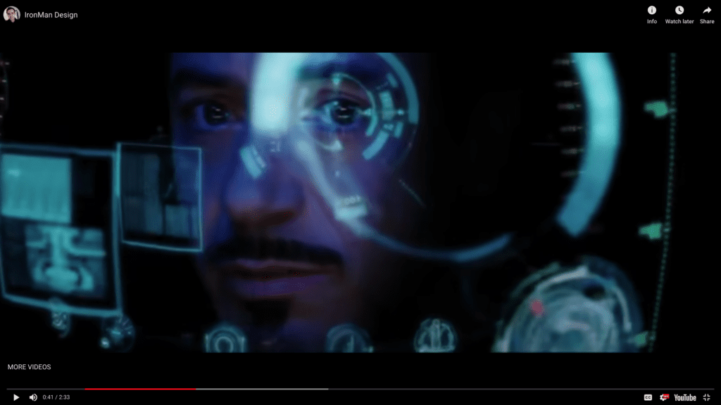
Spatial computing represents a paradigm shift in how we interact with technology. Moving beyond traditional screens, spatial computing immerses users in a 3D environment where digital content seamlessly integrates with the physical world. Imagine Tony Stark, aka Iron Man, who can view and process multiple forms of data in real time, giving him superhuman intelligence.
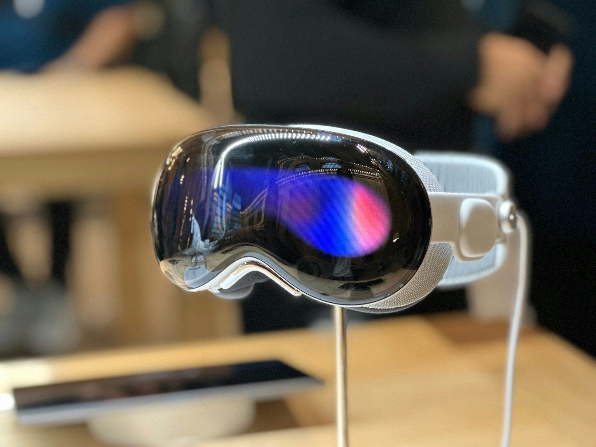
The Apple Vision Pro exemplifies this innovation, offering a glimpse into the potential of augmented reality (AR), virtual reality (VR), and mixed reality (MR) to reshape everyday experiences. By leveraging advanced sensors and spatial mapping, the Vision Pro allows users to interact with digital elements as if they were tangible objects in their environment. This immersive experience opens up new possibilities for entertainment, education, and productivity, setting the stage for a future where the boundaries between the digital and physical worlds blur.
Designing for Canvases Instead of Portals
As we transition into an era dominated by advanced computing, the approach to designing user interfaces must evolve. Traditional interfaces, confined to rectangular screens or “portals,” with a lot of vertical scrolling, will give way to dynamic and flexible “canvases” that adapt to various contexts and environments. This shift demands a reimagining of design principles, focusing on creating intuitive and immersive experiences that leverage the full potential of spatial computing.
For example, imagine an architect using AR to project a 3D model of a building onto a construction site, allowing stakeholders to explore and interact with the design in real time.
Additionally, consider the new infotainment systems in vehicles. Instead of a traditional dashboard, these systems provide a customizable canvas that adapts to the driver’s needs, displaying navigation, media, vehicle performance, and even real-time updates from the road environment. This flexible interface not only enhances the driving experience but also improves safety and convenience by providing contextually relevant information seamlessly integrated into the driving environment.
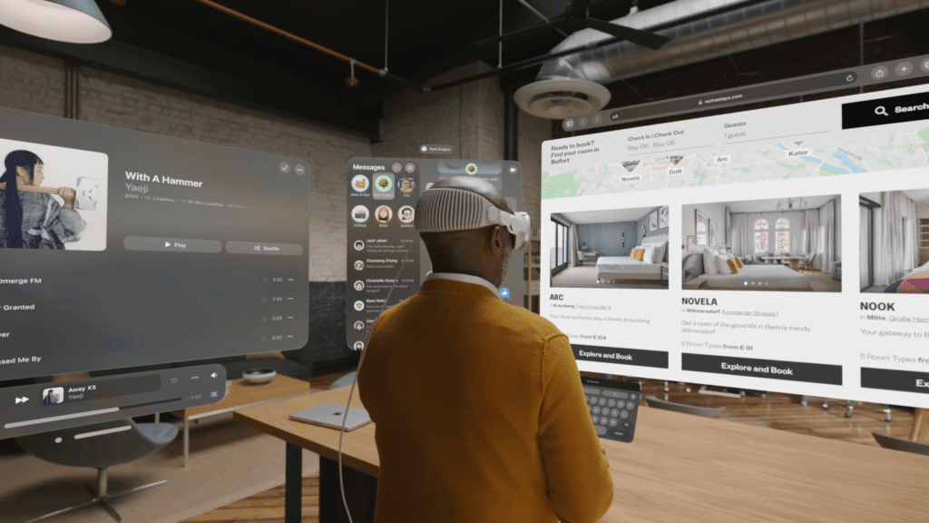
Virtual reality (VR) further expands the possibilities for designing beyond traditional portals. The Meta Quest, for example, offers an immersive environment where users can interact with digital content in a fully 3D space. In a VR setting, designers can create entire virtual worlds that users can explore and engage with, providing experiences that are both deeply interactive and visually stunning. Whether it’s for gaming, virtual meetings, or training simulations, VR can transform user experiences by offering a limitless canvas that goes beyond the physical constraints of conventional screens. This opens up new avenues for creativity and functionality, making the user experience more immersive and engaging than ever before.
Rendering 3D Content in the Browser
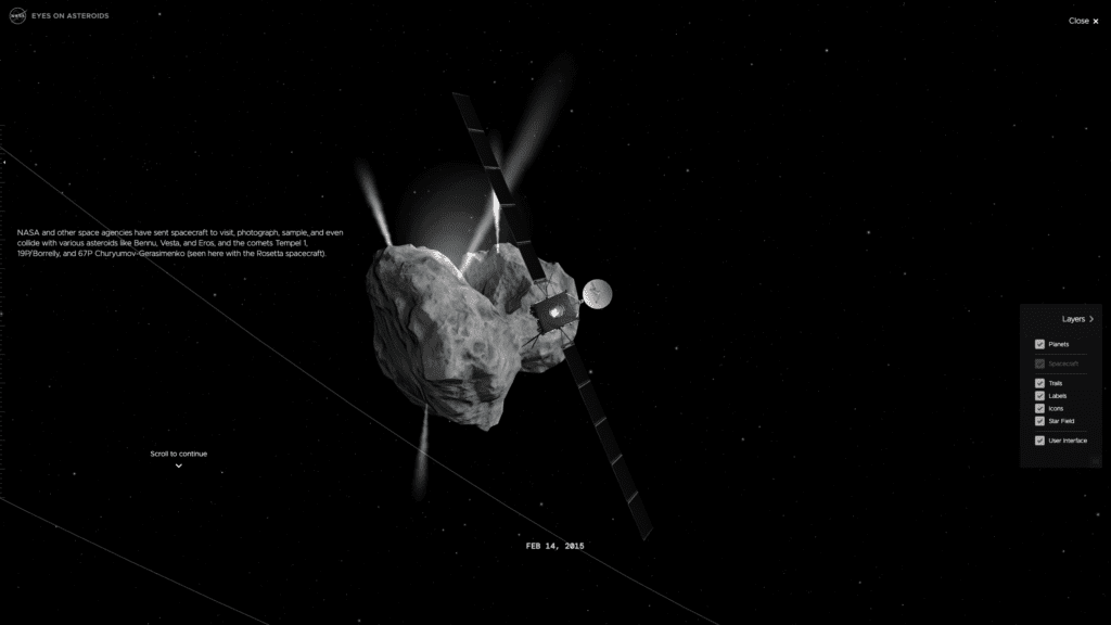
The ability to render 3D content directly in web browsers has been a game-changer for UX designers and developers. WebGL, a powerful graphics library, enables the creation of rich, interactive 3D experiences that run seamlessly across different devices and platforms. This technology has opened the door to a new realm of possibilities, from immersive gaming experiences to intricate data visualizations.
A prime example is NASA’s Eyes applications, which use WebGL to offer an interactive exploration of our solar system. Users can navigate through space, zoom in on planets and moons, and witness real-time data visualizations of spacecraft trajectories. By bringing high-quality 3D graphics to the web, WebGL empowers designers to create more engaging and interactive experiences that captivate users and drive deeper engagement.
Parting Words
The future of user experience is a thrilling frontier where spatial computing, canvas-based design, and WebGL-powered 3D content converge to redefine how we interact with technology. These innovations promise to create more immersive, intuitive, and engaging experiences, seamlessly blending the digital and physical worlds.
As we continue to explore and harness the potential of these technologies, the possibilities for enhancing our daily lives are boundless. By embracing these trends, designers and developers can pave the way for a future where user experience transcends traditional boundaries, delivering unprecedented levels of interactivity and immersion. The journey has just begun, and the future of UX holds exciting prospects that will reshape our digital experiences in ways we can only begin to imagine.
The journey from graphic design to UX/UI design is a rewarding but challenging transformation. While both fields prioritize creating visually appealing work, the approach, methodology, and end goals differ significantly. Graphic design emphasizes aesthetics, while UX/UI design centers around user experience, functionality, and interactivity. For graphic designers looking to transition into product design, understanding these differences and mastering new skills is essential.
Understanding the Core Differences
Designing for Different Canvases
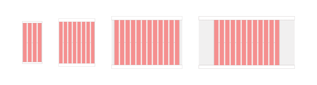
Graphic designers often work with static, fixed-size canvases. In contrast, product designers must consider multiple devices and screen sizes. Responsive design is crucial in UX/UI, requiring designers to create flexible layouts that work across desktops, tablets, and mobile devices. Understanding how to design for various screen sizes and ensuring a consistent user experience is a fundamental skill for product designers.
Caption: This illustration shows four different canvases — mobile, tablet, desktop, and wide screens — and their basic layout properties.
Focus on Functionality and User Experience
Graphic design is primarily about creating visually engaging content, such as logos, posters, and marketing materials. The emphasis is on aesthetics, typography, and visual harmony. In contrast, UX/UI design focuses on how a product feels and functions. It involves understanding user needs, creating intuitive interfaces, and ensuring a seamless user experience. The mantra of UX/UI design is “form follows function,” meaning that the design’s primary goal is to serve the user’s needs effectively before considering visual appeal.
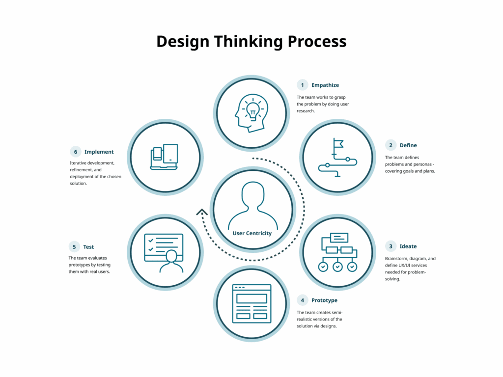
The Design Thinking Process
The UX/UI design process is more structured and iterative than traditional graphic design. It typically involves:
1. Empathize
Understand the needs, experiences, and challenges of users through research.
Techniques include:
User interviews
Observation
Surveys and questionnaires
2. Define
Clearly articulate the problem you are aiming to solve.
Methods include:
User personas
Problem statements
User journey maps
3. Ideate
Generate a wide range of ideas and potential solutions.
Techniques include:
Brainstorming sessions
Mind mapping
Sketching
4. Prototype
Create simple and cost-effective versions of proposed solutions.
Methods include:
Paper prototypes
Digital prototypes using tools like Sketch or Figma
Storyboards
5. Test
Evaluate prototypes with real users to gather feedback.
Methods include:
Usability testing
A/B testing
Feedback sessions
6. Implement
Translate the final design into a functional product.
This involves:
Design handoff with specifications and assets
Collaboration with developers
Quality assurance testing
Launch
Post-launch monitoring
Iteration
Design thinking is an iterative process. Based on feedback, designers may revisit previous steps to continually refine and improve solutions.
Learning the Technical Basics
One major difference between graphic and product design is the need for technical knowledge, particularly web technologies. Understanding HTML, CSS, and JavaScript is vital. While graphic designers often focus on pixel-perfect visuals, product designers must also consider technical constraints and browser behavior.
HTML (Hypertext Markup Language)
HTML defines structure and content.
Key basics:
Common tags such as div, span, p, a, img, h1–h6, ul, ol
Semantic HTML using header, footer, article, section
Attributes like class, id, href, src
Forms using form, input, label, button
CSS (Cascading Style Sheets)
CSS controls styling and layout.
Key basics:
Selectors and properties
The box model: content, padding, border, margin
Flexbox and Grid for layout
Responsive design with media queries
Caption: The CSS Box Model Module Level 3, provided by the W3C.
JavaScript
JavaScript adds interactivity.
Key basics:
Syntax fundamentals and variables
DOM manipulation using getElementById, querySelector, addEventListener, classList
Event handling
Libraries and frameworks such as jQuery or React
Mastering these foundations helps designers collaborate effectively with developers and build responsive, functional interfaces.
Building a UX/UI Skillset
Developing a robust UX/UI skillset is crucial. Visual design remains important, but expanding into research, architecture, interaction, and technical literacy is essential.
Key areas to develop:
User research
Information architecture
Wireframing and prototyping with tools like Figma
Interaction design principles
Usability and accessibility
Technical literacy in HTML, CSS, and JavaScript
Practical Steps to Transition
Transitioning can be challenging but manageable with a clear plan.
Education and Training: Take UX/UI courses or workshops.
Build a Portfolio: Redesign existing products or create new concepts that demonstrate your process.
Get Mentored: Seek guidance and feedback from experienced UX/UI professionals.
Gain Experience: Pursue internships or freelance projects to build practical skills.
Parting Words
Transitioning from graphic design to product design involves a shift in mindset, skillset, and process. By focusing on user experience, learning technical fundamentals, and embracing iterative design, graphic designers can successfully enter UX/UI. This evolution broadens your capabilities and enables you to create products that are both visually compelling and highly functional.
Key Takeaways
Emphasis on User Experience: Functionality and interaction take priority over pure aesthetics.
Designing for Multiple Devices: Responsive design is essential.
Comprehensive Skillset: Expand beyond visuals into research, architecture, and technical literacy.
Structured Design Thinking: Follow an iterative process of empathy, definition, ideation, prototyping, testing, and implementation.
Technical Integration: Understanding HTML, CSS, JavaScript, and the box model is critical for building responsive digital products.
Elevating excellence isn’t just a goal in product design; it is essential for staying competitive and meeting user expectations. This week, we explore strategies to scale and strengthen design teams for optimal performance. Through assessing current practices, building a strong foundation, strategic hiring, and commitment to scaling, organizations can enhance their product design teams effectively. This guide outlines actionable steps and strategies to navigate this journey toward product design excellence.
Understanding UX Maturity
UX maturity measures an organization’s ability and commitment to delivering user-centered design. It encompasses the quality and consistency of research and design processes, resources, tools, and operations, as well as the organization’s support and commitment to UX through leadership, workforce, and culture. Assessing UX maturity helps organizations understand their current strengths and weaknesses and provides a roadmap for improvement.
According to Forbes, studies show that companies that invest in UX see a lower cost of customer acquisition, lower support cost, increased customer retention, and increased market share.
Forrester has found that every $1 invested in UX results in a return of $100, a 9,900% ROI.
The UX Maturity Model
The UX Maturity Model offers a framework to evaluate an organization’s UX capabilities across six stages:
Absent: UX is ignored or nonexistent.
Limited: UX work is rare, haphazard, and lacks importance.
Emergent: UX efforts are functional but inconsistent and inefficient.
Structured: UX processes are semi-systematic and widespread but vary in effectiveness.
Integrated: Comprehensive and effective UX work is pervasive across the organization.
User-Driven: Dedication to UX at all levels results in deep insights and exceptional user-centered outcomes.
Factors in UX Maturity
None of these factors stand alone. They reinforce and enable each other. A holistic approach is essential to advance UX maturity and realize the full value of user-centered design.
Strategy: UX leadership, planning, and resource prioritization.
Culture: Cultivating UX knowledge and career growth for practitioners.
Process: Systematic use of UX research and design methods.
Outcomes: Defining and measuring UX results.
Assessing Current Processes and Practices
In assessing your current design processes and practices, it is crucial to identify both strengths and areas for improvement within your workflow. This evaluation provides insight into what is functioning well and where challenges exist.
Assessment of Current Practices
What aspects of our current design practice work well, and why?
Where do we encounter bottlenecks or inefficiencies?
Tools and Technologies
Are the tools and technologies we use meeting our needs?
Are there new tools or technologies we should consider adopting?
Design Standards and Guidelines
Do we have a comprehensive set of design standards and guidelines?
How well are these guidelines communicated and adhered to?
A thorough evaluation highlights strengths and uncovers areas that need improvement. Addressing these aspects helps streamline workflows, adopt better tools, and ensure adherence to standards, ultimately enhancing overall design quality and consistency.
Building a Strong Foundation
Establishing a solid foundation is crucial for scaling and strengthening a product design team. This involves ensuring that the basics are robust and well-defined.
Key Components of a Strong Foundation
Clear Design Vision
Design Systems
Tools and Resources
These components empower efficient scaling and strengthening of product design teams.
Clear Design Vision and Strategy
A clear design vision and strategy align the team’s efforts with company goals. This means defining a long-term vision that inspires and guides the team.
Vision Statement: Develop a statement that encapsulates the desired user experience, such as creating intuitive, accessible, and delightful digital experiences.
Strategic Goals: Set goals that support the vision, including improving satisfaction scores or increasing engagement metrics.
With a clear vision and strategy, teams can prioritize work and make decisions that support broader business objectives.
Design Systems
Implementing a design system ensures consistency and efficiency across design efforts. A design system includes reusable components, guidelines, and standards that maintain a coherent visual and interaction language.
Component Library: A shared library of UI components such as buttons, forms, and navigation elements.
Style Guide: A comprehensive guide covering typography, color palettes, iconography, and visual elements.
A well-maintained design system streamlines the design process, reduces redundancy, and keeps team members aligned.
Tools and Resources
Ensuring access to modern design tools and resources is critical for efficiency and innovation.
Design Software: Industry-standard tools like Figma for collaboration and prototyping.
User Research Tools: Platforms like UserTesting, Marvin, and Hotjar for usability testing and behavioral insights.
Collaboration Platforms: Tools such as Slack, Trello, or Asana for communication and project management.
Equipping teams with the right tools empowers them to produce higher-quality work more effectively.
Hiring and Team Structure
To effectively scale a product design team, a strategic approach to hiring and structure is essential. This includes assessing skills, fostering professional development, ensuring diversity, organizing teams efficiently, and establishing strong leadership.
In one referenced video, Joel Califa, former Product Designer at GitHub, shares lessons on structuring teams to meet business and organizational needs, determining who to hire, and setting hires up for success.
Skills Assessment
A thorough skills assessment identifies strengths and weaknesses within the team.
Inventory of Skills: Map existing capabilities such as UX research, UI design, prototyping, and accessibility.
Gap Analysis: Identify areas lacking expertise and address them through hiring or training.
Professional Development
Continuous learning keeps teams updated with trends and best practices.
Training Programs: Access to courses and certifications from platforms like Coursera or Nielsen Norman Group.
Conferences and Events: Attendance at UXPA, IxDA, or SmashingConf.
Internal Knowledge Sharing: Regular sessions for presenting learnings or case studies.
Design System Managers oversee system consistency.
Graphic Designers enhance aesthetics and brand expression.
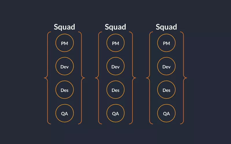
Team Structure
Cross-Functional Squads or Pods: Small teams combining designers, developers, and product managers focused on specific areas.
Centralized vs. Decentralized Teams: Centralization offers consistency and shared resources, while decentralization increases agility and responsiveness.
Caption: Buffer, a social media management platform, organizes its teams into squads.
Leadership
Strong leadership advocates for design value at the highest level. Appointing roles such as Chief Creative Officer, Chief Experience Officer, or VP of Design ensures design has executive representation.
Advocacy: Champions design in strategic discussions.
Mentorship and Growth: Supports junior designers and attracts top talent.
Scaling and Future Growth
As organizations expand, scaling design practices becomes increasingly important. This involves addressing growth challenges, implementing scalable processes, and strengthening knowledge sharing and documentation.
Case Study: Airbnb
Airbnb structures its design organization to promote scalability while maintaining creativity and collaboration.
Cross-Functional Teams integrate designers with engineers and product managers.
DesignOps supports workflows, systems, and resources.
Design System DLS maintains consistency and collaboration.
Distributed Teams tap global talent pools.
Culture of Feedback and Learning encourages open critiques and growth.
Scaling Practices
Maintaining Consistency through robust design systems.
Coordination Across Teams with cross-functional squads and shared documentation.
Scaling Research Efforts with centralized repositories and tools like Dovetail.
Talent Acquisition and Retention through strong employer branding and growth opportunities.
Knowledge Sharing and Documentation
Effective documentation ensures continuity and improvement.
Process Documentation with step-by-step guides.
Decision Logs capturing rationale.
Outcome Reporting through retrospectives and metrics.
Regular Knowledge-Sharing Sessions and Collaborative Platforms.
Mentorship Programs to transfer skills and build culture.
A Practical Plan for Scaling
Phase 1 Foundation
Assess maturity
Establish vision and strategy
Appoint design leadership
Implement a design system
Phase 2 Growth
Hire diverse talent
Invest in tools and learning
Integrate design thinking
Phase 3 Optimization
Refine processes
Measure impact
Foster continuous improvement
Championing Quality from the Top Down and Bottom Up
Investment in Design through budgets and resources.
Bottom-Up Approach
Continuous Learning through education and events.
Feedback Mechanisms with critiques and reviews.
Empowerment giving designers autonomy and ownership.
Case Study: IBM
Top-Down Leadership: IBM established a Chief Design Officer role reporting directly to the CEO, embedding design into strategy.
Bottom-Up Empowerment: Company-wide design thinking workshops and internal communities encourage collaboration and growth.
Handling Lack of Prioritization
Educate Stakeholders with case studies and data.
Deliver Quick Wins to demonstrate value.
Internal Advocacy from design leaders in meetings and strategy sessions.
Establish Metrics to Measure the Impact and Quality of Design
Metrics provide tangible data to guide decisions and demonstrate value.
Trackable Metrics
Surveys including NPS
Usability Testing measuring success rates and errors
Design Efficiency
Time Tracking across phases
Iteration Cycles monitoring refinements
Business Iimpact
Conversion rates through A/B testing
User retention via cohort analysis
Revenue impact through sales and lifetime value metrics
Collaboration and Communication
Assess collaboration effectiveness between designers, developers, and stakeholders.
Use tools like Figma or Miro for real-time feedback.
Establish structured communication channels and visual aids.
Provide training in communication skills.
Feedback and Reflection
Assess feedback mechanisms such as usability tests and stakeholder reviews.
Streamline feedback loops with scheduled sessions and tools.
Reflect on past projects to document lessons learned and integrate improvements into future work.
Actionable Steps
Set Goals
Define clear objectives such as improving consistency or increasing satisfaction.
Establish metrics to track progress
Implementation Plan
Identify quick wins like adopting tools or improving documentation.
Assign responsibility and timelines with regular reviews.
Parting Words
Scaling and strengthening a product design team requires strategic leadership, clear processes, continuous learning, and a strong culture of design thinking. By following a structured plan and championing quality from both the top down and bottom up, organizations can build better products and foster lasting innovation.
Key Takeaways
Understanding UX Maturity is essential for identifying strengths and creating improvement roadmaps.
Building a Strong Foundation through vision, systems, and resources enables scale.
Hiring and Team Structure drive effectiveness and adaptability.
Scaling and Future Growth require coordination, documentation, and knowledge sharing.
Championing Quality at all organizational levels ensures sustained design excellence.
Pernice, K., Gibbons, S., Moran, K., & Whitenton, K. The 6 Levels of UX Maturity. Nielsen Norman Group.
As I reflect on the significance of accessibility in digital product design, I’m reminded of the deeply personal journey that has shaped my perspective on this topic. From navigating life with a disability to raising a child with autism, witnessing the challenges faced by my best friend, who is missing an arm, and experiencing firsthand the realities of growing up in poverty, I’ve come to intimately understand the importance of inclusive design practices. These experiences have fueled my fierce passion for advocating for accessibility in all facets of life, particularly in digital product design.
For me, accessibility isn’t just a professional obligation — it’s a deeply ingrained commitment that stems from empathy, understanding, and a relentless drive to ensure that everyone, regardless of their abilities or socioeconomic background, can access and engage with digital content with ease and dignity. It is my hope that by championing accessibility in my endeavors, I can create a more inclusive and equitable world — one where every individual has the opportunity to thrive and participate fully in the digital landscape.
Introduction
Web accessibility standards and guidelines serve as cornerstones for inclusive design, guiding seasoned professionals like product owners, designers, and developers in their quest for excellence. While this audience possesses a solid grasp of accessibility principles, this article aims to elevate their expertise by exploring advanced strategies and techniques. By embracing continuous improvement and innovation, we can create digital experiences that not only meet but exceed the needs of all users.
Understanding Diversity and Accessibility Needs
Understanding the diverse socioeconomic backgrounds and accessibility needs of users is paramount for creating truly inclusive digital experiences. When we fail to design with disabilities and/or disadvantages in mind, we not only limit the accessibility of our products but also restrict the potential audience we can effectively market to.
Consider this:
Over 1 billion people — 12.5 percent of the world’s population — have visual impairments¹
Adult ADHD affects more than 8 million adults²
About 130 million adults in the U.S. have low literacy skills
Around 15% of the U.S. population has some form of learning disability
4 in 10 U.S. adults say they have no disposable income³
These statistics underscore the importance of designing digital products and services that are accessible, equitable, and cater to the diverse needs of all users.
Designing for Diversity
Inclusive design goes beyond ticking boxes — it’s a guiding principle that informs every aspect of the design process.
Examples:
User Research & Personas – Include diverse demographics and lived experiences
Cultural Sensitivity – Avoid stereotypes and conduct cultural research
Inclusive Language – Avoid exclusionary phrasing
Accessible Typography – Legible fonts and scalable sizes
Color Contrast – Ensure readability for low vision and color deficiency
Accessibility isn’t merely a checkbox — it is a moral imperative and a commitment to inclusivity and equity. Our work shapes the experiences of real people. By embracing continuous improvement and cultivating accessibility champions, we pave the way for a digital future that is truly accessible to all.
Thank you for taking the time to read my article. I invite you to share your thoughts or feedback in the comments and check back soon for the next piece.
Sources
National Library of Medicine – World Blindness and Visual Impairment
National Library of Medicine – Adult ADHD Prevalence
Federal Reserve – Economic Well-Being of U.S. Households 2022
At the heart of innovation lies the examination and refinement of design concepts, ensuring they align with user needs, business objectives, brand guidelines, and technical feasibility. A framework for product design reviews is indispensable to navigate this process with precision and purpose. In this article, we dive into the intricacies of such a framework, exploring strategies to elevate excellence in product design reviews.
From establishing clear objectives to fostering a culture of constructive feedback, we unveil essential components for conducting impactful design reviews that drive exceptional outcomes. Join me as we embark on a journey to optimize the product design review process and unleash the full potential of your team’s creativity and collaboration.
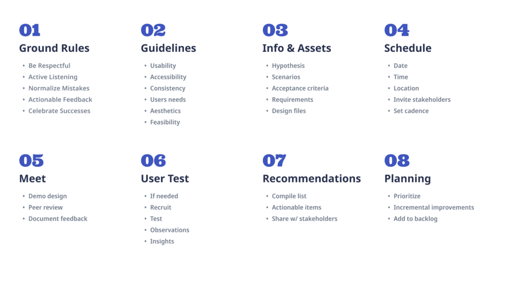
Ground Rules
Effective design reviews play a pivotal role in fostering collaboration and sparking innovation within a team. To maximize the productivity and creativity of these sessions, it’s important to set clear ground rules that prioritize respect, active listening, and constructive feedback. These ground rules serve as the foundation for an environment where creativity flourishes, collaboration thrives, and continuous improvement is embraced.
Ground Rules Checklist
Be Respectful – Focus on merits and improvement areas rather than personal opinions.
Active Listening – Listen without interruption and ask clarifying questions.
Normalize Mistakes – View feedback as an opportunity for growth.
Actionable Feedback – Provide specific, practical suggestions.
Celebrate Successes – Recognize effort and highlight wins.
By adhering to these ground rules, we cultivate an environment that nurtures creativity, collaboration, and continuous improvement.
Guidelines
A comprehensive set of design review guidelines is crucial for ensuring that every aspect of a design is meticulously examined and refined. These guidelines serve as a roadmap for evaluating effectiveness and user-friendliness.
Usability
Clarity
Efficiency
Learnability
Error Handling
Accessibility
WCAG Compliance
Keyboard Navigation
Color Contrast
Consistency
Visual Consistency
Interaction Consistency
Platform Guidelines
Alignment with User Needs
Research Insights
Persona Alignment
Task Alignment
Visual Design
Aesthetic Appeal
Brand Consistency
Typography & Readability
Technical Feasibility
Feasibility Analysis
Scalability
Compatibility
Feedback & Iteration
Solicitation of Feedback
Iterative Refinement
Flexibility for Change
Frequency / Cadence
Design reviews should occur regularly throughout the project lifecycle. Weekly or bi-weekly is appropriate for most teams. Larger projects may require milestone reviews after wireframes, prototypes, or major iterations. The cadence should match the value being gained from feedback.
Key Reminder:For most projects, weekly or bi-weekly reviews are appropriate.
Essential Info & Assets
Before a design review begins, gather the necessary information and assets to enable productive discussion.
Essential Info Checklist
Requirements – Acceptance criteria and stakeholder goals
Technical Constraints – Platform or performance limitations
User Research Findings – Interviews, surveys, usability insights
Designs – Visual comps, flows, specs, Figma links
Previous Feedback – Iterations and updates made
Having this information enables informed decision-making and constructive collaboration.
Putting Guidelines into Practice: A Case Study
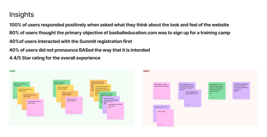
In this section, we walk through a real-life design review example. The designer provides all necessary information and assets. The team evaluates the design, identifies improvements, conducts user testing, and compiles actionable items to guide iteration. This demonstrates practical application of the framework.
Essential Info (Example)
Hypothesis: Adding a class finder below the header increases registrations.
User Type: New users in awareness-to-action funnel.
Requirements: Jira story link.
Designs: Figma link.
Technical Constraints: WordPress block builder with Tailwind.
Previous Feedback: Intent confusion caused by new component placement.
Feedback
Feedback falls into two categories: Qualitative and Quantitative.
Qualitative
Subjective impressions validated through testing and observation.
Examples
It looks busy
Initial intent is unclear
Lacks contrast
Too many styles
Quantitative
Objective measurements and rule-based assessments.
Examples
Too many primary buttons
Line length exceeds 80 characters
Broken heading hierarchy
Accessibility non-compliance
Too many font styles
Inconsistent capitalization
Mobile layout breaks
Remove custom letter spacing
User Testing
This section demonstrates qualitative feedback validation through observation and testing.
Recommendations
After testing and peer review, actionable changes are assembled.
Actionable changes
Update heading hierarchy
Use secondary and tertiary buttons
Utilize text links
Normalize font styles
Remove border radius on inputs
Update responsive breakpoints
Reduce line length
Shorten long sentences
Improve screen reader support
Consider A/B testing placement
Sharing recommendations with stakeholders and developing an implementation plan ensures alignment and execution.
Closing Thoughts
Design reviews are a critical component in the iterative process of creating exceptional user experiences. Through structured guidelines, collaboration, and validated feedback, teams can refine designs, ensure alignment with user needs, and drive continuous innovation. The principles outlined here empower teams to deliver products that resonate with users, support business success, and create lasting impact.
Thank you for taking the time to read this article. I invite you to share your thoughts or feedback in the comments and check back soon for the next piece.
Note: This article is part of a series on Figma Fundamentals.
By following the step-by-step process outlined in this lesson, you will create a base component, utilize instances for efficiency, and maintain uniformity across your design. In addition, you may practice inclusive design by exploring accessibility considerations. As you continue to apply these fundamentals in your projects, you are not just creating visually appealing interfaces, you are also fostering a user-centric approach.
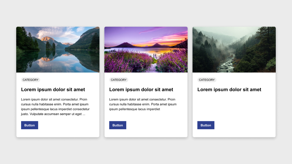
Objective
Create a row of three cards in Figma, ensuring consistency in height and structure. One card will serve as the base component while the other two will be instances of this component.
Elements
Each card should include:
Image
Category badge
Title
Description
Button
Process
Design the base card by arranging the elements according to the provided example.
Convert this base card into a component by selecting it and clicking Create Component in the toolbar or using the shortcut Ctrl/Cmd + Alt + K.
Duplicate the component twice to create two instances beside the original.
Customize the content of the instances as needed while keeping spacing and design elements consistent.
Ensure all three cards maintain the same height for a uniform appearance.
Experiment with responsive behavior by adjusting layout or content and observing how the cards adapt to different screen sizes.
Bonus
Use this accessibility plugin to verify that your component passes accessibility standards.
As we conclude this lesson in the Figma Fundamentals series, thank you for being part of the learning journey. Join me again next week as we explore a new topic.
If you would like to continue the conversation, share your thoughts in the comments. If you found this helpful, consider sharing it with your network. Until next time, keep practicing, experimenting, and refining your skills. Design is a journey of continuous improvement.
Note: This article is part of a series on Figma Fundamentals.
This lesson outlines Figma’s version history functionality, including accessing, managing, comparing versions, and reverting to earlier iterations. The goal is to empower designers to track design progress and maintain control over the evolution of their projects.
Accessing Version History
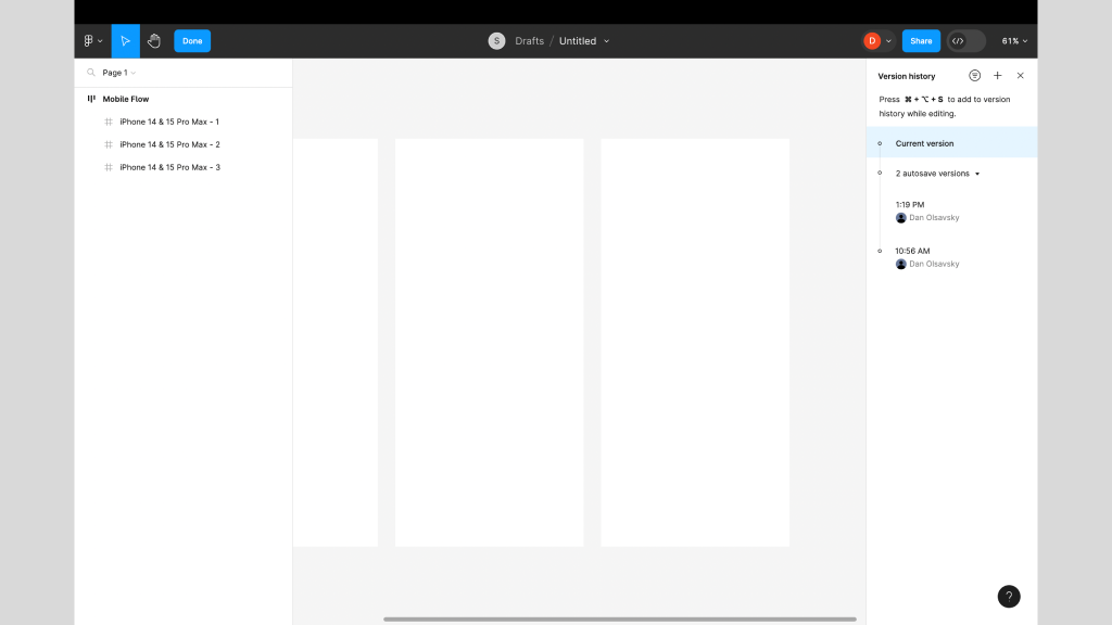
Figma maintains a comprehensive version history that allows users to review and restore previous iterations of design files.
Reviewing Versions
Users can access version history through File → Show Version History, where they can browse snapshots of a file’s evolution over time. Each version represents a specific stage of the design.
Restoring Previous Versions
Designers can restore earlier versions of a file, giving them flexibility to revert to specific iterations whenever needed.
Caption:This screenshot displays the Version History panel on the right.
Managing Changes Over Time
Figma’s version history allows users to compare versions, track modifications, and better understand how a design has evolved.
Comparing Versions
Designers can view two versions side by side to visualize what changed between iterations. This makes it easier to understand progress and decision paths.
Tracking Modifications
Figma records and displays what elements were added, removed, or altered in each version, helping teams maintain clarity and accountability.
Reverting to Older Versions
Version history empowers designers to safely explore ideas while maintaining the ability to return to stable points in time.
Restoring Specific Iterations
Users can quickly revert to older versions, ensuring flexibility when experimenting or recovering from mistakes.
Maintaining Design Integrity
Reverting preserves the integrity of a design and protects against unintended changes.
Exercise: Archiving Pages in a File
To reinforce these concepts, complete the following exercise while watching the accompanying tutorial. Follow along in Figma using any existing or new file. This hands-on activity helps solidify your understanding and builds real-time proficiency.
Video Tutorial:
Parting Words
As we conclude this week’s lesson on Figma Fundamentals, thank you for being part of the learning journey. Join me again next week as we continue exploring new topics. If you would like to continue the conversation, share your thoughts in the comments. If you found this article helpful, consider sharing it with your network. Keep practicing, experimenting, and refining your skills. Design is a journey of continuous improvement.
Note: This article is part of a series on Figma Fundamentals.
This lesson covers Figma’s collaboration features, including real-time editing, comments, sharing permissions, branching, change tracking, and version control. The goal is to help designers and teams work together efficiently while maintaining clarity and control over their files.
Collaborating in Real Time
Figma enables seamless real-time collaboration so multiple team members can work together in the same file simultaneously.
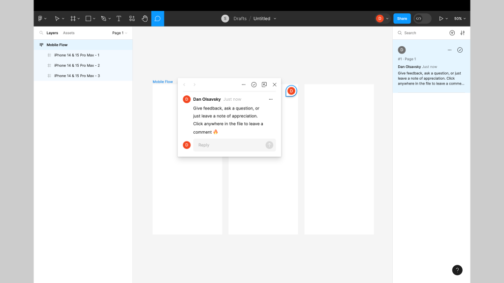
Comments and Mentions
Users can leave comments directly on specific design elements to facilitate discussion and feedback. Using the @ mention notifies teammates and keeps communication focused and contextual.
Shared Editing
Multiple users can edit a design file at the same time. This ensures everyone is working on the most up-to-date version and reduces delays caused by file handoffs.
Captions: This screenshot shows a user-generated comment in Figma. Enable comment mode and click anywhere in a file to leave feedback, ask a question, or add a note.
Sharing Figma Files
Figma offers flexible sharing capabilities that allow designers to control access and permissions for collaborators.
Permission Settings
Designers can define who can view, comment, or edit files. This ensures only authorized individuals can make changes.
Team Collaboration
Sharing files with teammates or clients streamlines collaboration and keeps everyone aligned with the latest updates.
Branching Files
Designers can create branches within files so different teams or individuals can work on separate versions. Branching supports parallel development without affecting the main file until changes are ready to merge.
Using Collaboration Features
Figma provides tools that help teams manage collaborative workflows and maintain version control.
Change Tracking
Figma records who made changes and when, giving visibility into design evolution and accountability.
Resolving Conflicts
When conflicting edits occur, Figma provides merge and conflict resolution tools to keep collaboration cohesive.
Version Control
Version history allows designers to access and revert to earlier iterations whenever necessary.
Exercise: Branching and Merging
To reinforce these concepts, complete the following exercise while watching the accompanying tutorial. Follow along in Figma using any existing or new file. This hands-on activity helps solidify your understanding and builds real-time proficiency.
Video Tutorial:
Parting Words
As we conclude this lesson on Figma Fundamentals, thank you for being part of the learning journey. Join me again next week as we continue exploring new topics. If you would like to continue the conversation, share your thoughts in the comments. If you found this article helpful, consider sharing it with your network. Keep practicing, experimenting, and refining your skills. Design is a journey of continuous improvement.
Note: This article is part of a series on Figma Fundamentals.
This lesson covers the basics of prototyping within Figma, including creating interactive prototypes, adding essential interactions, and using Figma’s environment for previewing and testing designs to ensure a seamless user experience.
Creating Interactive Prototypes
Figma enables designers to create interactive prototypes by linking frames and screens to simulate user flows and interactions.
Linking Frames
Designers can create interactive prototypes by linking frames or artboards together. This establishes connections between screens and enables seamless navigation.
Establishing User Flow
By linking frames with interactions, designers define the user journey, allowing stakeholders to visualize and understand the flow of the design.
Exercise: Prototyping
In our pursuit of hands-on learning, I’ve curated an engaging exercise to explore the principles discussed in this lesson. Watch the video tutorial and follow along in Figma using two blank frames. This exercise will help solidify your understanding and build real-time proficiency.
Video Tutorial:
Adding Basic Interactions
Figma empowers designers to add basic interactions to prototypes, enhancing user experience and functionality.
Hover Effects
Designers can simulate hover effects by linking frames with mouse-over interactions. This replicates how elements respond when hovered, creating a more realistic experience.
Click-Through Actions
Adding click interactions to elements allows users to simulate actions like button clicks or menu selections, navigating between linked frames.
Transitions
Figma provides transition effects such as slide, dissolve, and smart animate that designers can apply between frames. These transitions add dynamism and polish to a prototype.
Previewing and Testing Prototypes
Figma offers an interactive environment for designers to preview and test prototypes to ensure a seamless user experience.
Interactive Preview
Designers can preview prototypes within Figma’s environment, simulating user interactions to evaluate functionality and flow.
Testing Functionality
Testing prototypes helps identify usability issues or inconsistencies in the user flow, creating an opportunity for refinement before implementation.
Advanced Exercise: Prototyping and Transitions
To go a level deeper, watch the following tutorial and apply what you learn in your own file. This exercise reinforces transitions and adds polish to your interactions.
Video Tutorial:
Parting Words
As we conclude this week’s lesson on Figma Fundamentals, thank you for being part of the learning journey. Join me again next week as we continue exploring Figma. Want to continue the conversation? Drop your thoughts in the comments below.
If you found today’s article helpful, please consider sharing it with your network. Until next time, keep practicing, experimenting, and refining your skills. Remember, design is a journey of continuous improvement!
Note: This article is part of a series on Figma Fundamentals.
This lesson covers the exploration of Figma’s plugin ecosystem, the integration of Figma with third-party tools for enhanced collaboration, and the use of plugins to customize and augment Figma’s functionality to suit specific design needs.
Exploring Figma’s Plugin Ecosystem
Figma offers a diverse ecosystem of plugins that extend its functionality and support a wide range of design needs.
Installing Plugins
Access Figma’s plugin library through the Community tab in the Figma app or via Figma’s website. You can browse, install, and manage plugins directly within Figma.
Using Plugins
Once installed, plugins appear in the side panel within Figma. From there, you can run plugin features and use them to support your design workflows.
Integrating with Third-Party Tools
Figma supports integrations with third-party tools that help teams collaborate and stay aligned.
Seamless Workflows
Integrations with tools like Slack, GitHub, and others streamline collaboration by enabling teams to embed designs, share feedback, and synchronize design updates directly within those platforms.
Cross-Platform Functionality
Integrations help bridge communication gaps between Figma and other platforms, enabling teams to work efficiently across different environments.
Customizing Figma with Plugins
Plugins empower users to tailor Figma to their specific needs and increase productivity.
Enhanced Functionality
Plugins can extend Figma’s capabilities for tasks like data visualization, prototyping, accessibility checks, and more.
Improved Collaboration
Some plugins focus on collaboration, supporting workflows like design handoff, team coordination, and operational consistency.
Exercise: Utilizing Plugins
In our pursuit of hands-on learning, I’ve curated an engaging exercise to explore the principles discussed in this lesson. Install the plugins below and experiment in Figma. This exercise will help solidify your understanding and build real-time proficiency.
Recommended Plugins
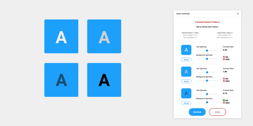
Color Contrast Checker
This plugin checks the color contrast ratio of all visible text in a frame and provides feedback on whether it meets WCAG AA and/or AAA compliance. Click the “Try it out” button to experiment in a Figma file.
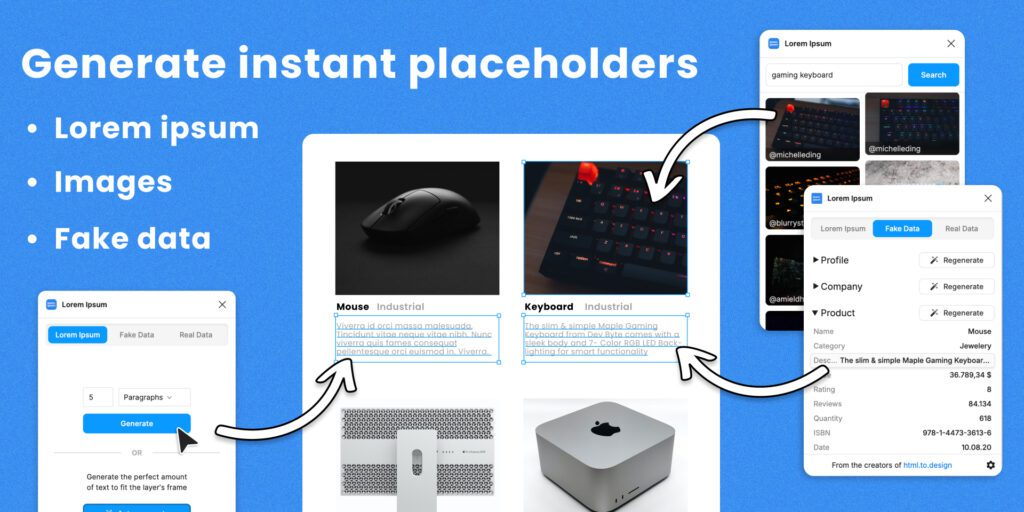
Fill your designs with placeholders in a click: text, images, and even data. Generate Lorem Ipsum to fill text layers, fill shapes with images from Unsplash, and populate designs with fake data such as profiles or company info. Click the “Try it out” button to experiment in a Figma file.
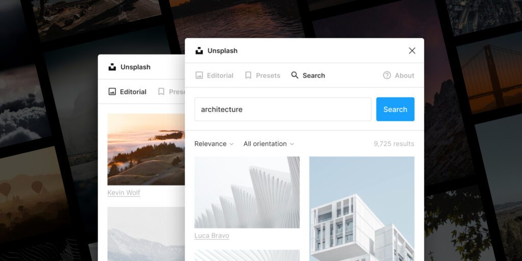
Insert beautiful images from Unsplash into your designs. The Unsplash License allows images to be used freely for both commercial and personal projects. Click the “Try it out” button to experiment in a Figma file.
As we conclude this week’s lesson on Figma Fundamentals, thank you for being part of the learning journey. Join me again next week for more as we continue to explore Figma.
Until next time, keep practicing, experimenting, and refining your skills. Remember, design is a journey of continuous improvement!
Want to continue the conversation? Drop your thoughts in the comments below. If you found today’s article helpful, please consider sharing it with your network.