TimeKeepr: A Mobile Time and Project Tracking App
Principal Product Designer & Frontend Developer
B2B
Workforce Management
Internal tool
Startup
Contract
2014-2015
Context
TimeKeepr is a multilingual mobile time and project tracking app for iOS and Android that simplifies timekeeping and payroll processes for contractors, small businesses, and distributed teams. In addition to the mobile experience for workers, a desktop version was created for administrators to manage approvals, monitor workforce activity, and support payroll operations.
As the founder and lead designer, I was responsible for end-to-end product design and strategy, including research, UX/UI, front-end development, and testing. The product also supported QuickBooks integration and was developed in collaboration with a remote, agile team.
Overall Impact
- Saved workers an estimated 1 to 2 hours per week by eliminating manual timecard submission and in-person delivery
- Reduced payroll errors by 85%, exceeding the original goal by 35%
- Reached 93% worker adoption in the first 3 months
- Logged more than 19,000 hours in the first 3 months after launch
- Improved user satisfaction through ease of use and multilingual accessibility
- Created a streamlined mobile and desktop workflow for both workers and office administrators
The Problem
Manual timekeeping methods created inefficiency across the entire payroll workflow.
Teams were dealing with:
- Paper-based timecards that had to be completed and delivered manually
- Frequent payroll errors caused by missing or inaccurate entries
- Approval delays that disrupted payroll cycles
- Low visibility into workforce activity and project hours
- A need for multilingual support across a distributed workforce
- Disconnected workflows between workers in the field and administrators in the office
This was not just a form digitization effort. It was an opportunity to simplify a high-friction operational workflow and build a more reliable system for both workers and payroll teams.
My Role
I led the product from strategy through implementation.
My responsibilities included:
- Defining product strategy and MVP scope
- Facilitating kickoff planning and stakeholder alignment
- Conducting user research with workers and office administrators
- Developing personas, journey maps, user flows, wireframes, and prototypes
- Designing the high-fidelity mobile and desktop experiences
- Creating and maintaining the design system and front-end component library
- Supporting front-end development and implementation
- Testing the product with users and stakeholders in iterative cycles
Approach
1. Project Kickoff & Planning
To lay the groundwork for the rebuild and rebrand, I facilitated a structured kickoff session using a planning canvas. This helped align stakeholders, identify constraints, and clarify goals before research and design began.
The kickoff covered:
Participants, goals, and target users
- Activities, deliverables, and milestones
- Risks, constraints, and scope
- MVP priorities and validation metrics
- This process surfaced several important factors early:
- We had a 12-week timeline and limited engineering resources, so MVP prioritization was critical
- The need for multilingual support and mobile-first design emerged immediately based on user demographics and jobsite conditions
Impact: Created early alignment and gave the team a clear foundation for prioritization, research, and design strategy.
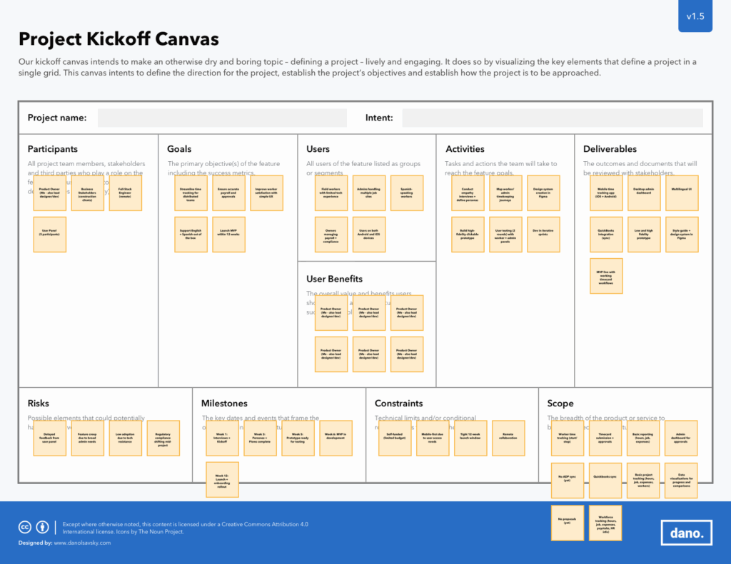
Caption: A structured planning canvas was used to align stakeholders, define scope, identify risks, and shape the MVP strategy.
2. Empathize: Understanding the Users
I conducted interviews with both business stakeholders and end users to understand the problem from multiple angles. This helped align user needs with operational goals and clarified where the biggest friction points existed.
Key user insights included:
- Workers often forgot to record their time at the jobsite, which created downstream errors
- Office administrators struggled with delayed approvals and incomplete records that disrupted payroll
- Users needed a system that was fast, clear, and accessible in their preferred language
Research outputs included:
- Empathy maps
- Journey maps built in UXPressia
- Two primary personas, Workers and Office Administrators
Impact: Clarified the distinct needs of both field workers and office teams, helping shape a solution that worked across the full workflow.
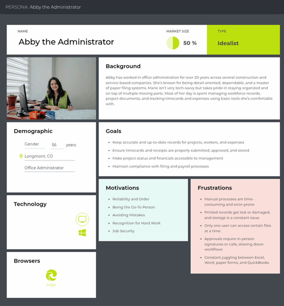
Caption: One of the primary personas created to guide the design of approval workflows, reporting needs, and administrative efficiency.
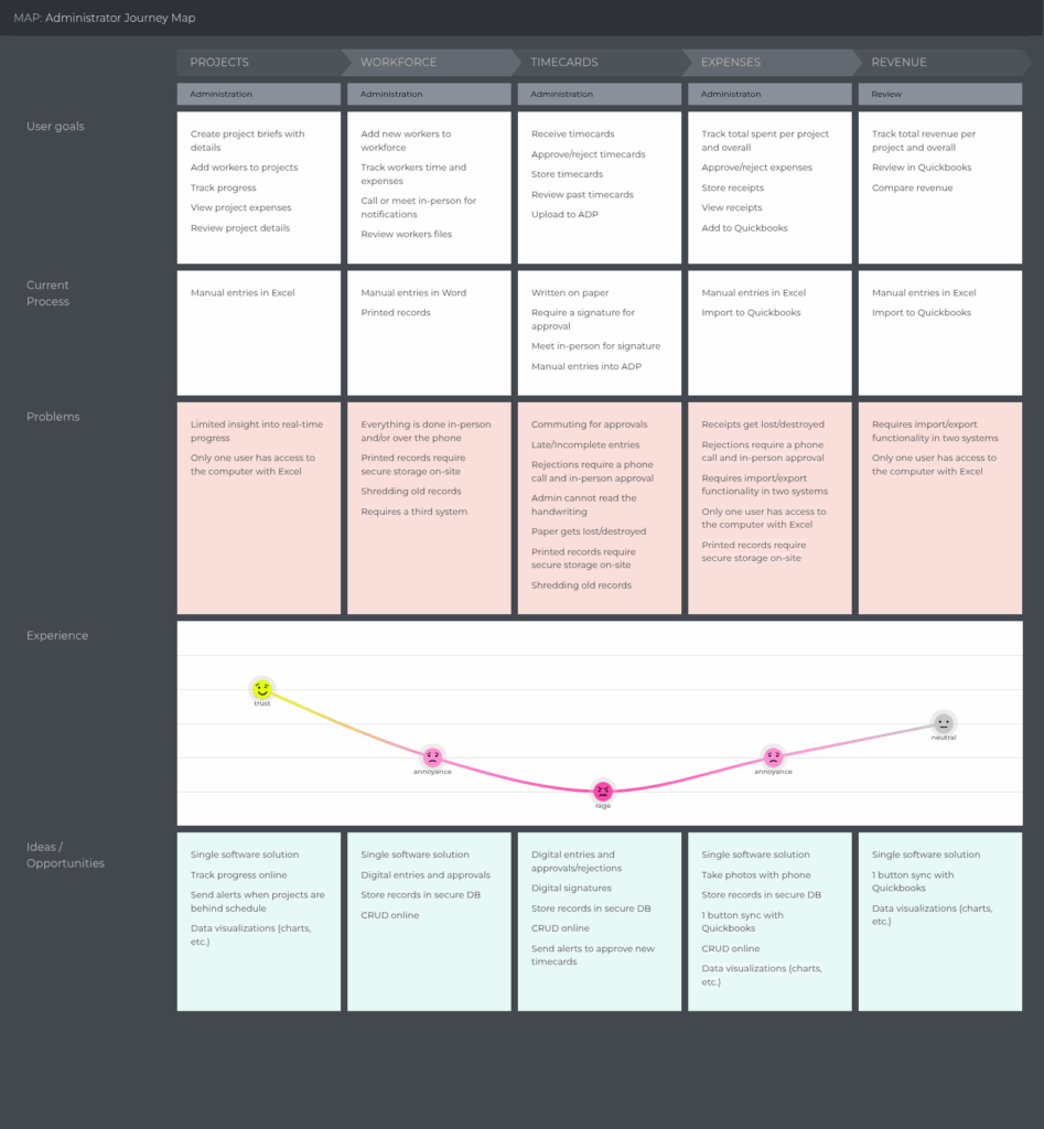
Caption: A lean journey map used to identify pain points, delays, and opportunities across the approval and payroll process.
3. Define: Framing the Problem
After research, I translated the findings into a focused product direction.
Problem Statement
Manual timekeeping methods are inefficient, error-prone, and time-consuming. Delays in timecard approvals and inconsistent payroll data create bottlenecks that disrupt payroll cycles and compliance. Businesses need a seamless, multilingual timekeeping system that ensures accuracy, efficiency, and regulatory alignment.
Success metrics included:
- Eliminate the need to submit timecards manually
- Reduce payroll errors by at least 50%
- Achieve 90% adoption within the first month
- Improve employee satisfaction
Metric tracking included:
- Tracking the number of manual timecards submitted post-launch
- Manual logging of payroll errors against a baseline
- Workforce adoption data visualized in-app
- Hotjar surveys to measure satisfaction
Impact: Established a clear problem statement and measurable success criteria that aligned user needs with business outcomes.
4. Ideate: Exploring Possibilities
Through collaborative brainstorming and prioritization exercises, I worked with the team to identify the most valuable features for the MVP.
Activities included:
- Brainstorming workshops
- Impact versus effort mapping
- Cross-functional prioritization sessions
Features prioritized for the MVP included:
- Real-time time entry
- Multilingual support
- Digital signatures
- QuickBooks integration
Impact: Helped the team focus on the highest-value features within a short timeline and limited engineering bandwidth.
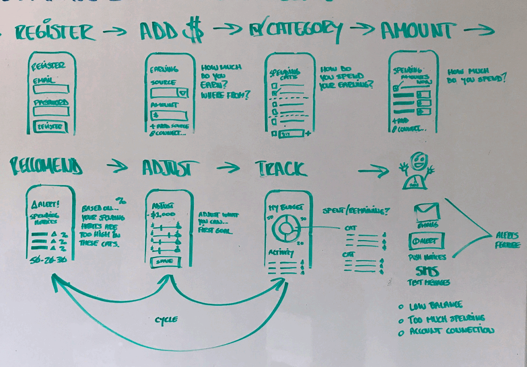
Caption: Re-thinking the original workflow which was dependent on paper timecards, manual delivery, and delayed approvals, creating friction for both workers and office administrators.
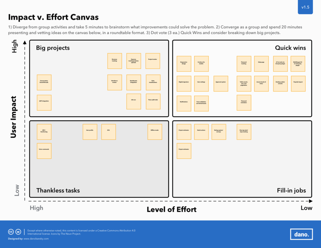
Caption: A cross-functional exercise used to prioritize features based on business value and implementation complexity.
5. Prototype: Bringing It to Life
I mapped user interactions and system logic through wireframes and flows, then created the high-fidelity product experience in Figma.
This phase included:
- Wireframes for worker and administrator flows
- Flow diagrams for time entry, approvals, and payroll support
- A Bootstrap-based design system for consistency and faster implementation
- High-fidelity visual specifications for both mobile and desktop experiences
Impact: Created a unified system that supported both fast development and a more intuitive experience across user roles.
Caption: A wireframe flow used to clarify the logic and interaction design of timecard creation and submission.
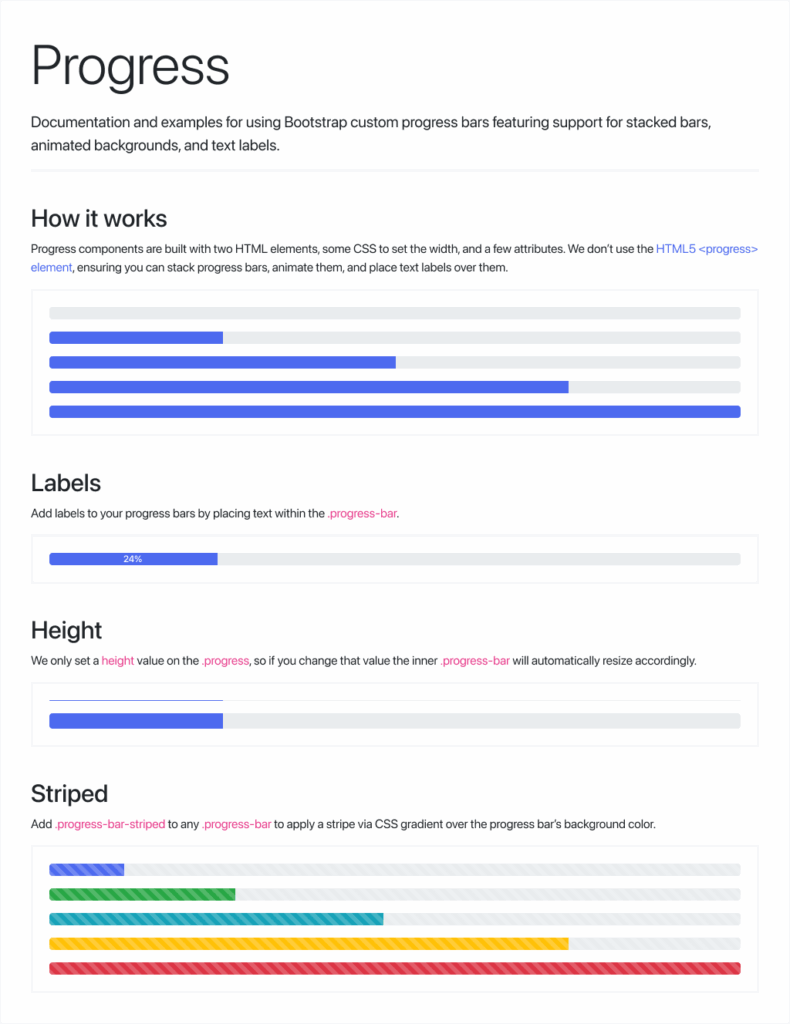
Caption: A reusable component from the TimeKeepr UI kit, based on Bootstrap UI, designed for consistency and efficient handoff.
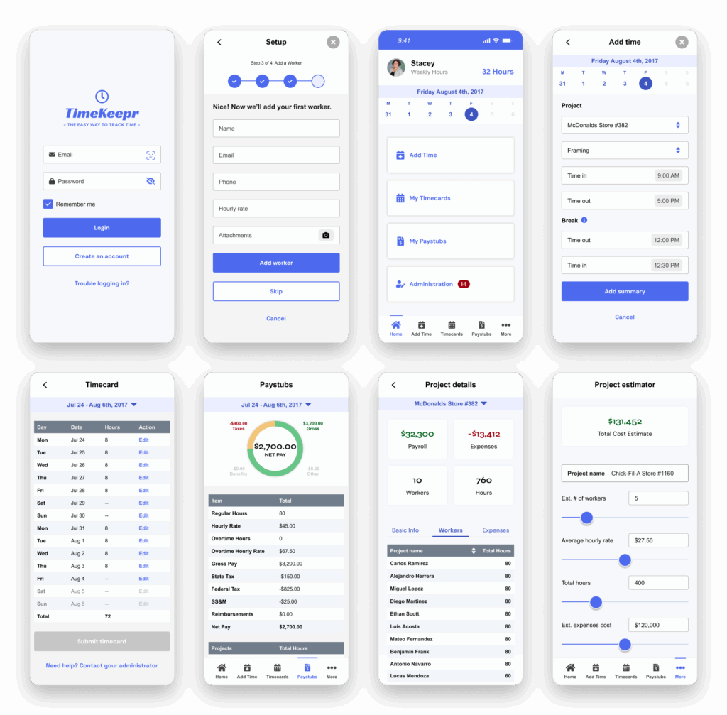
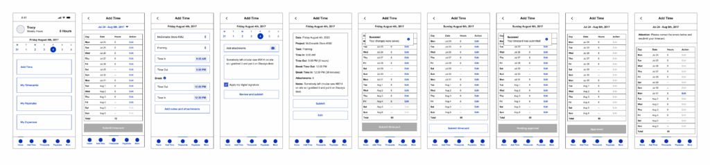
Caption: An example of the polished product interface for the TimeKeepr experience.
6. Test: Validating and Iterating
The business team and user panel reviewed prototypes and provided usability feedback through structured testing. After two refinement cycles, the app aligned with both stakeholder expectations and usability benchmarks.
Testing included:
- A user panel of 5 participants
- Think-aloud sessions to capture real-time reactions
- On-site follow-ups with field workers to validate mobile UX in real-world conditions
- Screen recordings to identify hesitation and friction points
- Post-session surveys to measure satisfaction and ease of use
- Internal QA reviews for edge cases and non-happy path behaviors
- Internal demos with stakeholders
Key testing insights included:
- Administrators had trouble finding pending approvals, so I reorganized navigation and added visual status indicators
- Spanish-speaking users encountered mixed-language elements, so I corrected inconsistencies and added a full language toggle in settings
- Some users were unsure whether time had been saved when moving quickly between screens, so I improved the visibility and persistence of confirmation messages.
Worker Testimonial
“TimeKeepr makes clocking in and out so easy. I don’t have to meet with my supervisor anymore for approvals or worry about forgetting my hours. Plus, I can switch to Spanish when I need to. It just works.”
Javier, Framing Contractor @ Mountain States Framing
Office Administrator Testimonial
“Approving timecards used to take forever, especially when people missed their entries. With TimeKeepr, everything’s digital, organized, and synced with QuickBooks. It’s saved us hours each week and cut down on payroll errors.”
Stacey Blackwell, Office Manager at Mountain States Framing
Impact: Improved clarity, confidence, and usability across both worker and administrator experiences before launch
7. Bridging Design and Development
Working in short, iterative sprints, I translated prototypes into production-ready front-end components. While the developer created a skeleton UI based on wireframes, I incrementally delivered the branded front-end layer and partnered closely throughout implementation.
This phase included:
- Creating responsive front-end components
- Translating the design system into production-ready UI patterns
- Collaborating with the development team during implementation
- Supporting QA and refinement as the product moved toward release
Impact: Helped bridge strategy, design, and implementation into a cohesive product experience delivered within a tight timeline.
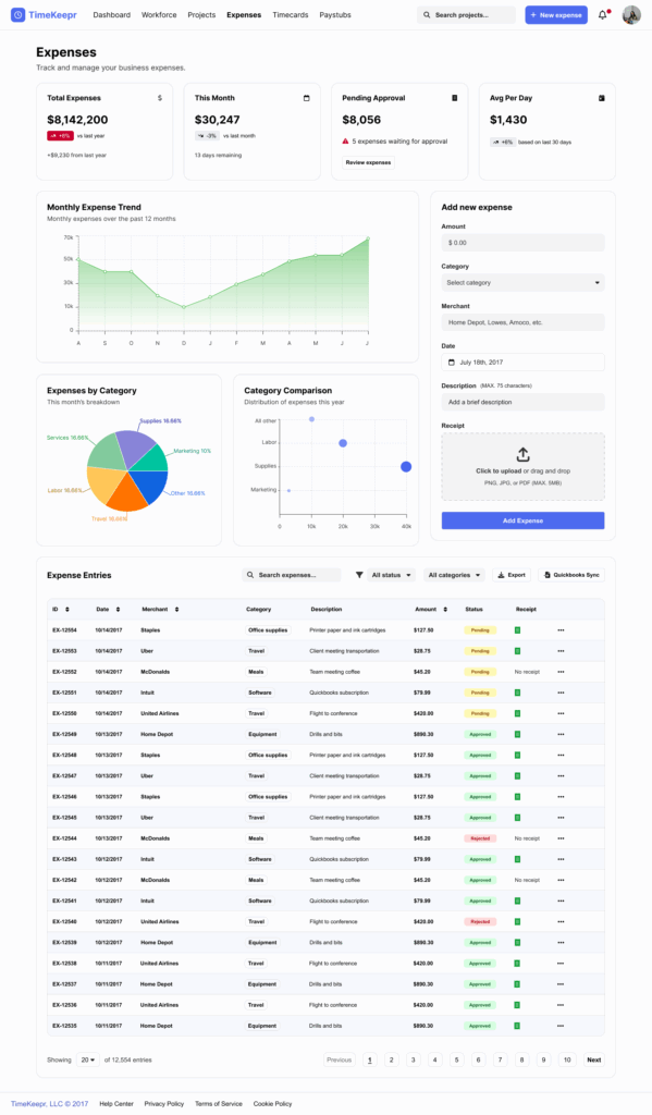
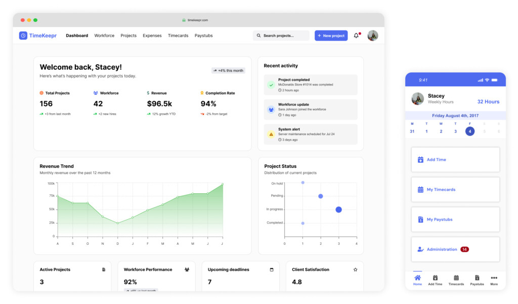
Caption: The final responsive desktop dashboard used by administrators to manage approvals and monitor workforce activity.
Key Learning
TimeKeepr reinforced how powerful it can be to combine product strategy, UX research, and technical execution in one tightly scoped product effort.
The project highlighted the importance of multilingual support, stakeholder alignment, and fast iteration when designing tools for real-world use. It also showed how much value can be unlocked by simplifying operational workflows that people rely on every day.
Reflection
Looking back, there are two things I would have done differently.
First, I would have documented decisions and user feedback more formally throughout the sprints to better preserve the rationale behind major pivots.
Second, I would have invested more time upfront in validating technical constraints to reduce scope creep and avoid rework later in the process.
Confidentiality Note
Portions of this case study have been generalized or omitted to respect client confidentiality and non-disclosure agreements. The information presented reflects work I am authorized to share publicly while preserving the integrity of proprietary data, internal processes, and sensitive business details.